• Home
  • Shop
  • Completed Costumes/Impressions
  • Emma and Her Dresses
  • Patterns & Kits
  • Free Patterns and Instructions

Kitty Calash

~ Confessions of a Known Bonnet-Wearer

Kitty Calash

Category Archives: Literature

To Make a Standard

22 Monday Apr 2019

Posted by kittycalash in History, Literature, material culture, Museums, Research

≈ 5 Comments

Tags

flags, Flower's Artificers, material culture, Museum of the American Revolution, Rebecca Flower Young, Research, sewing

British wool bunting flag said to have been given to Tecumseh. NMAI Catalog number 23/730.

When I set out to “be” Rebecca Young, I thought I knew how flags were made in the 18th century– after all, I’ve made and seen a wide range of 18th and early 19th century items. But I was surprised when I got a look at a War of 1812 flag in the collection of the National Museum of the American Indian. (This was the closest, fastest option for getting a close-up look at an original, near-period flag in wool bunting, thanks to an inside connection.)

The questions I had were:

What materials were used? (My guesses were correct: wool bunting and unbleached linen thread)
What seam techniques were used? (See below)
How was a flag assembled? (Sequence of parts; see below)

The conservator shared the flag’s condition and treatment report with me in advance, and it was helpful:

My sketch of the Tecumseh flag

“Based on notes written by Phyllis Dillon, 1977(?): The flag is constructed of 9″
wide panels of plain weave wool bunting (24 threads/inch) sewn together with french seams (approx. 1/4″ wide) using beige (white/red) and brown (blue/white; blue/blue) 2-ply S linen threads in a running stitch. The canton is constructed similarly using strips of white and red bunting with similar thread count. The hoist (approximately 1 1/4″ wide) is made from a plain weave, coarse, undyed linen folded over the raw edges of the seamed rows of bunting and stitched with a beige (undyed) linen thread; there are three hand-stitched grommets/eyelets at the corners and the center of the hoist which appear to use the same type of linen thread as the hoist stitching. (See analysis section for fiber ID). The blue bunting at the lower and upper edges of the flag are selvage edges, the fly edge is folded over and stitched with a 1/2″ wide hem.”

The date of the notes (42 years ago?) concerned me, and I wondered about the french seams. Most of what we see in the period are felled seams, so it seemed possible there was some confusion about the terminology. I’m confused about it after looking at tutorials and descriptions online, but perhaps that’s just me– in any case, the only way to answer this was to go and look.

What did I find?

Mistress V shows visitors our modern wool bunting flag

Materials
Wool bunting and silk were the most common materials used to make flags, colo(u)rs, and standards in the 18th and early 19th centuries. Colours, as advertised by Rebecca Young, likely referred to regimental colours, though a naval “colour” could mean a national flag flown by the ship. During the Revolutionary War, there were state navies in addition to a Continental Navy, further complicating the issue. (This complication also existed in the army. There are parallels today in the state National Guard units, which operate under a state or commonwealth governor, unless called into federal service. It’s your state national guard that comes to dig you out of your car in a major blizzard, but they can also be called to serve in wars, as you may recall from such debacles as Abu Ghraib.) Bunting came from Sudbury, England, and was woven in narrow strips. The strips on the Tecumseh flag are about 9 ½” seamed, suggesting that the width was about 10” including selvedges. Narrow strips are more flexible for assembly, and allow extensive use of selvedges to make seams narrower and stronger, because they’re less likely to fray.

Techniques
The running stitches in the Tecumseh flag threw me, because I’d expected back stitches, or combination stitch at least, but when I started working with the bunting, I understood. The loose weave of the bunting will pull and distort if you apply too much tension, so a backstitch would, in the end, be less useful than a running stitch. I doubt this is true of silk flags, though; silk, being more tightly woven, would better withstand a backstitch.

Wrong Side
Wrong Side
Right Side
Right Side

Because the Tecumseh flag is mounted and framed in a plexiglas case, I couldn’t touch the seams, or see the backs, and the conservators don’t seem to have photographed both sides when the flag was being treated– or at least images were not available to me. This leaves open the question of exactly how the seams were done, but my best guess based on areas of loss is that the strips were stitched together with a slight offset, like a felled seam, and then the overlap was tucked under and stitched down with a running stitch.

women sewing

This is less efficient: one person assembling an entire flag alone.

Assembly
This was probably the most delightful part of the research: figuring out how all the pieces went together. Once you see it, you can’t unsee it: flags were assembled in component parts, which were then assembled into wholes. Once we were working on the flag at the museum, the reason became clear: it’s so much quicker and easier to have multiple people working on parts, with one person assembling these parts, than to have one person per flag. This is proto-assembly line work, and it existed in 18th century workshops from tailors to cabinetmakers. Specialization equals speed, and the key to making money as a contractor supplying the army was quantity.


Canton components: A, B, C, D , E and F are assembled; AEB and CFD are sewn together to make two long rectangles, which are then sewn to the long sides of G.

In the case of the Tecumseh flag, there are three main components: the lower three strips, the upper three strips, and the canton, which is comprised of 7 parts. Each was assembled individually; then the canton and the three shorter strips were joined, and sewn to the long lower piece. After that, the hoist was attached and the far edge of the fly hemmed. Only then was the flag finished and ready for delivery.

Describing how strip(es) were assembled to become the Fort Mifflin flag.

The Fort Mifflin flag, 13 stripes of red, white and blue bunting, ending in red, would have been assembled in strips of two and then three, and then grouped and assembled. Working with Mistress V, the greater efficiency of assembling components became clearer. This hand-on quasi-experiment clarified some questions about how military contractors worked in the 18th century– at least the ones sewing. The system had to include multiple hands, working together in a shop or doing piecework at home for assembly elsewhere. There was just no other way to efficiently make the quantities of goods– 500 linen liners for light horse caps; 293 shirts; multiple standards and colours– at the speed the army required. The quantities also suggest that Rebecca Young was not just a widow-turned-contractor, but that she had working and organizing experience before she was widowed, along with a network of contacts who, along with some of her children, helped produce these goods.

Share this:

  • Facebook
  • Pinterest
  • Email
  • Twitter

Like this:

Like Loading...

Spring Spencers

01 Monday Feb 2016

Posted by kittycalash in History, Literature, Research

≈ 5 Comments

Tags

19th century, 19th century clothing, Ackermann's Repository, fashion, fashion plates, Federal style, Research, resources

Spencers are not unlike bonnets, in my mind. They’re more work than a bonnet, sure, but compared to the layer cake that is an English gown, a Spencer is a batch of cupcakes.

I’ve fondled more silks than I may care to admit (oh, remnant table, how I love thee), and often picked up and put down a small length because it was patterned. Not enough for a gown, just enough for a Spencer. But Spencers are always solid.

No, they’re not.

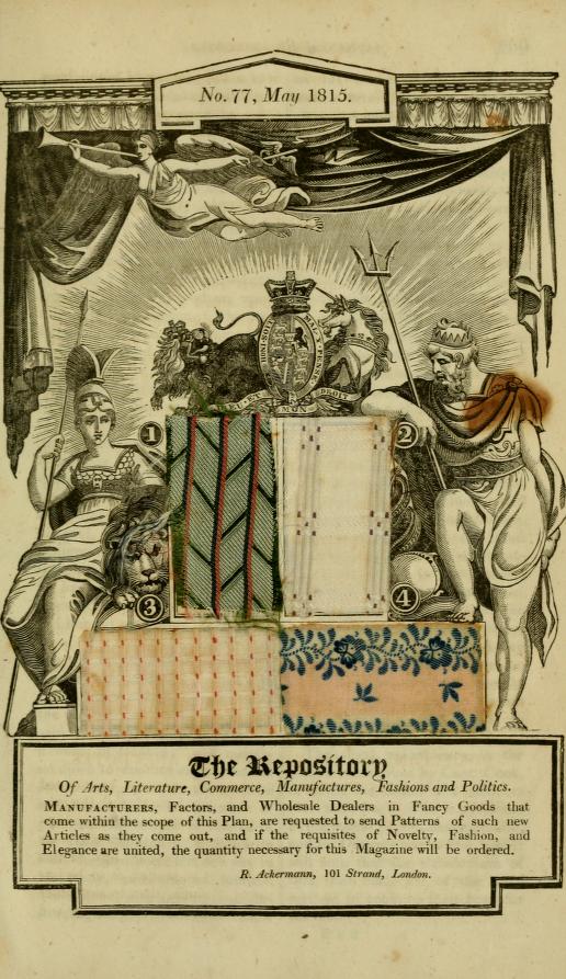
Allegorical Wood-Cut, with Patterns of British Manufactures. May, 1815. Ackermans's Repository of Arts, etc. Volume 13.

Allegorical Wood-Cut, with Patterns of British Manufactures. May, 1815. Ackermans’s Repository of Arts, etc. Volume 13.

It’s a Homer-quality forehead-slapping moment.

Caption, Allegorical Wood-Cut of British Manufactures. Ackermans's Repository of Arts, etc. Volume 13, May, 1815. page 298

Caption, Allegorical Wood-Cut of British Manufactures. Ackermans’s Repository of Arts, etc. Volume 13, May, 1815. page 298

Not only are there extant cotton roller-print Spencers, and wild printed cotton Spencer ensembles in North American collections, there’s print evidence of patterned silks for Spencers. Somehow, until I came across this plate and the description in Ackermann’s, I could not make the leap from cotton to silk.

Despite the existence of this.

My sole defense is that one patterned Spencer is still a zebra among horses.

But additional evidence, in the form of recommendations for spring in Ackermann’s? The zebra’s looking a little more like a horse.

Want more Ackermann’s? You know you do. The links are better sorted here.

Many, many thanks to Mr B for the tip!

Share this:

  • Facebook
  • Pinterest
  • Email
  • Twitter

Like this:

Like Loading...

Wolf Whistle

08 Wednesday Apr 2015

Posted by kittycalash in History, Literature, Living History, TV Review

≈ 3 Comments

Tags

Anne Boleyn, art history, authenticity, Hilary Mantel, historic interiors, interpretation, Thomas Cromwell, TV Review, Wolf Hall

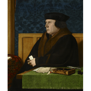
Thomas Cromwell, Hans Holbein the Younger. The Frick Collection,1915.1.76

Thomas Cromwell, Hans Holbein the Younger. The Frick Collection,1915.1.76

At last it has arrived: Wolf Hall. I waited, and did not use a proxy server to watch it early. Just as well that I watch PBS online as I have, thus far, watched the first episode three times.

At last I can understand people’s enthusiasm for historical programs some of us seethe at and cannot watch: my knowledge of the Tudors and their material world is limited enough that I am captivated and not annoyed (except by Anne Boleyn’s wrinkled silk satin bodice, which is striking in its puckers) and I read the books when they came out, and have thus forgotten enough of the details to be merely annoyed and not enraged at changes. (Other, real, critics have caught the language changes in the scene with Wolsey; Mantel is better, of course.)

The third Wolf-watching was with Mr S, who was suitably impressed by the low-light filming. As a former photographer who did a lot of night photography, improper and unbelievable lighting in film does cause an outbreak of caustic commentary. Not this time (he merely noted the fill light on Liz Cromwell’s face in one scene). With 20,000 pounds spent on candles, the BBC did this one right– and lucky for them the advance in camera technology.

But forgot the astronomical cost of all those tapers, that’s not the point: the point is what was believable and how the staging and lighting were used. I believed Wolf Hall all the more because of the low light, indoors and out, matching the time of day. I know how dim it is to light only with candles, and what a pain it is to make them, and how expensive. Light is money, whether you’re paying Ameren, National Grid, or the candlestick maker.

Aside from Hilary Mantel’s brilliant stories and all those candles, what makes this Wolf Hall good television? You know what I’m going to say: the authenticity. No, there are no Tudor accents, late or otherwise; these folks use our vernacular. And excellent arguments can be had about the historical accuracy of Mantel’s characters.

There are other arguments about the material details:

“The dull palette used – presumably in conscious contrast to The Tudors – created an ambience which, at worst, was lacklustre or, at best, homely. And it is that homeliness that concerns me most.

The homely is unthreatening. So, we are invited to view a ‘Tudor world’ as we know it or, rather, as we would like it to be. For instance, I was struck by how classless the society was – social gradation seemed to have disappeared both in the interactions and the interiors. There was little sense (as there is in the novels) of the heavy distaste for a man of such lowly birth as Cromwell’s; there was limited hauteur in a Norfolk or, indeed, the king. Meanwhile, the buildings which were home to Cromwell – still, at this point a lawyer in Wolsey’s service – seemed to lack none of the late-medieval conveniences afforded to the higher born and bettered housed. This is a world which has been domesticated for us so that it is tame, familiar and quintessentially English.”

Anne Boleyn
by Unknown artist
oil on panel, late 16th century (circa 1533-1536)
21 3/8 in. x 16 3/8 in. (543 mm x 416 mm)
Purchased, 1882. NPG 668 [Britain}

I will say that I was struck not just by the cleanliness of everything in an age before detergents (the blacksmith’s yard is remarkably pristine) and the amount of stuff in Cromwell’s house, but also by the softness of class lines. An argument could be made that depicting that much background detail would distract from the larger story, that of Cromwell and Anne and Thomas More, and the dissolution of the Catholic church in England.*

I know Cromwell ended up with riches but on the BBC he seemed to start ahead of where I thought he was at the start of the novel, mercenary and mercantile background aside.

Still: the spirit of the story and of Mantel’s Cromwell seem well-drawn here, and that’s what makes the difference between a series of living Holbeins and a gripping tale. That’s also what makes the difference between museum mannequins and costumed interpreters: emotional authenticity.

No: you cannot get costume and material culture wrong and still claim emotional authenticity as your defense. But the factor that makes a good event or site great is the believability of the characters, and that means more than a lecture on fine details. It means understanding the past, and even admitting what we don’t understand, and seek still to learn.

* Here’s an interesting and tough take on Cromwell’s work destroying the church.

Share this:

  • Facebook
  • Pinterest
  • Email
  • Twitter

Like this:

Like Loading...

Newport Friends

30 Thursday Jan 2014

Posted by kittycalash in Clothing, Events, History, Literature, Living History, Museums, Research

≈ 9 Comments

Tags

18th century clothing, 19th century clothing, authenticity, dress, fashion, living history, museum collections, Museums, Newport, Newport Historical Society, Quakers, Research, Rhode Island, Rhode Island history, style

Newport History, V 65, Part 1. Number 222.

Newport History, V 65, Part 1. Number 222.

I had a bit of a surprise when details emerged about the program Sew 18th Century and I will be doing in early March at her workplace. I’ve known about this since late October, but only started focusing on this last weekend, when I realized just how close March really is, and how much time I’ll be spending on well-chlorinated pool decks in February. I’m so glad I asked, because it turns out that we’re reading letters from a family of Quakers. I was not expecting Quakers, and had what is probably a completely inappropriate fabric in mind! (Off-white meandering red floral vines, to mimic a V&A gown.)

Still, there is no surprise that cannot be managed by research. There is an article about the family in Newport History, and they were kind enough to send it to me, and it arrived yesterday. Yay, mail in a small state! The article is helpful in providing context and family history, and there is even a photo, probably from a daguerreotype, of one of the women in the family.

Ruth Williams silhouette, Newport Historical Society, 91.14.4

So, what did Quaker women in Newport wear between 1800 and 1820? Lappet caps, for one thing. Lappet caps appear to have been a common cap in late 18th and early 19th century Rhode Island, and Ruth’s silhouette seems to bear that out.

These caps are also seen in many images of Quaker women, and borne out by the images in the collection where I work (sadly not appearing the catalog record, but still stable in the blog post on caps).

I can’t read letters in just a cap and a shift (it’s not that kind of event), so I need a dress. Newport Historical Society has two possibly Quaker gowns from the early 19th century, and they seem like plausible models.  But they raise questions quite aside from what you might find out by digging into provenance. What’s up with collars?

Brown silk Quaker dress, Newport Historical Society, 20.4.1
Brown silk Quaker Dress, Newport Historical Society, D77

The form, a brown or drab front-closing, high-waisted (but not too high) gown, with long sleeves and a pieced, shaped back, is consistent with images of Quaker women from the first quarter of the 19th century. The color and material (brown silk) is consistent with those images, and with earlier im,ages of Philadelphia Quaker women, and that all matches up with a gown that was worn by Sarah Brown of Providence. But the collar is curious, and without putting the garment on a dress form, it’s hard to tell exactly where the collar would fall, and how it would lie.

A Quaker's dress of greenish-brown taffeta American, Early 19th century. MFA Boston. 52.1769

A Quaker’s dress of greenish-brown taffeta
American, Early 19th century. MFA Boston. 52.1769

This gown at the MFA seems iconic to me, and I can imagine it underneath the white linen, cotton or silk kerchiefs and shawls of the portraits.

To learn more about Quaker aesthetics, I’ll be taking a trip down the hill to the RISD Library sometime this week, to look at books and articles. of particular interest is Quaker Aesthetics: Reflections on a Quaker Ethic in American Design and Consumption, 1720-1920. I’m also interested in an article by Deborah Kraak, Variations on ‘Plainness’: Quaker Dress in 18th Century Philadelphia. It’s not Newport, but at least it’s this continent.

I have read The Quaker: A Study in Costume, by Amelia Mott Gummere, and found it to be a pretty challenging work. It is possible that paint fumes made the writing seem more disjointed than it is, but I thought Gummere’s time-skipping references made it hard to follow the changes in Quaker dress in America, beyond what I do expect from a book published in 1901.

Share this:

  • Facebook
  • Pinterest
  • Email
  • Twitter

Like this:

Like Loading...

Letters for Service

25 Friday Oct 2013

Posted by kittycalash in History, Literature

≈ Leave a comment

Tags

19th century, examples, instruction manuals, letter writing, letters

The Letter, oil on canvas by Pietro Longhi. MMA 14.32.1.

The Letter, oil on canvas by Pietro Longhi. MMA 14.32.1.

Sew 18th Century wrote me the loveliest letter, and ever since I have been remiss in my epistolary duty. To better prepare myself, I took a look at a lovely little imprint at work, The Fashionable American Letter Writer: or, The Art of Polite Correspondence (Providence: Edward and J.W. Cory. 1833) which is thus far the earliest letter writing manual I have found in that collection. Below you will find some examples about servants, or for servants.

Letter XXV.—Recommending a Man Servant.
Sir—
The bearer has served me with integrity and fidelity these three years, but having a desire to settle in New-York, he left my house about a week ago, and by a letter received from him this day, I find you are willing to employ him on my recommendation., and it is with the greatest pleasure that I comply with his request. His behavior while with me was strictly honest, sober, and diligent, and I doubt not but it will be the same with you. I have sent this enclosed in one to himself, and if you employ him, I hope he will give satisfaction.
I am, sir, your humble servant,

Letter LXX.—From a young Woman just gone to service, to her mother in the country.
Dear Mother—
It is now a month that I have been at Mr Wilson’s. My master and mistress are both worthy people, and greatly respected by all their neighbors. At my first coming here I thought every thing strange, and wondered to see such multitudes of people in the streets; but what I suffer most from is, the remembrance of yours and my father’s kindness; but I begin to be more reconciled to my state, as I know you were not able to support me at home. I return you a thousand thanks for the kind advice you was so good as to give me at parting, and I shall endeavor to practice them as long as I live. Let me hear from you as often as you have an opportunity. With my duty to you and father, and kind love to all friends, I remain ever,
Your most dutiful daughter,

Letter LXXI.—The Mother’s Answer.
My Dear Child—
I am glad to hear that you reside in so worthy a family. You know that we should never have parted with you had it not been for your good. If you continue virtuous and obliging, all the family will love and esteem you. Keep yourself employed as much as you can, and be always ready to assist your fellow servants. Never speak ill of anybody; but when you hear a bad story, try to soften it as much as you can. I am in great hopes that all the family are kind to you, from the good character I have heard of them. If you have any time to spare from your business, I hope you will spend some part of it reading your Bible, and other religious books. I pray for you daily, and there is nothing I desire more than my dear child’s happiness. Your father desires his blessing, and your brothers and sisters their kind love to you. Heaven bless you, my dear child, and continue you to be a comfort to us all, and particularly to
Your affectionate mother,

Share this:

  • Facebook
  • Pinterest
  • Email
  • Twitter

Like this:

Like Loading...
← Older posts

Kitty Calash FB

Kitty Calash FB

Kitty Calash on IGram

Prototyping. #bonnets #millinery #milliner #fashionplates #19thcenturyfashion #1800

The Etsy Shop!

Kitty Calash Swag on Teespring

Archives

Enter your email address to follow this blog and receive notifications of new posts by email.

Join 1,928 other followers

Blogroll

  • A Most Beguiling Accomplishment
  • Afroculinaria: Michael Twitty
  • British Tars
  • Clothing the Carolinas
  • Drunk Tailor
  • History Research Shenanigans
  • Kleidung um 1800
  • New Vintage Lady
  • Not Your Momma's History
  • Our Girl History
  • Picking for Pleasure
  • Places in Time
  • Ran Away From the Subscriber
  • Slave Rebellion Reenactment
  • The Hidden Wardrobe
  • The Quintessential Clothes Pen
  • Worn Through

Etsy Shop

  • Kitty Calash on Etsy

Resources

  • Casey Fashion Plate Collection, LAPL

Sutlers

  • Burnley & Trowbridge
  • Wm Booth, Draper
wordpress statistics

Creative Commons License
Kitty Calash blog by Kirsten Hammerstrom is licensed under a Creative Commons Attribution-NonCommercial-ShareAlike 4.0 International License.

A WordPress.com Website.

  • Follow Following
    • Kitty Calash
    • Join 1,928 other followers
    • Already have a WordPress.com account? Log in now.
    • Kitty Calash
    • Customize
    • Follow Following
    • Sign up
    • Log in
    • Report this content
    • View site in Reader
    • Manage subscriptions
    • Collapse this bar
 

Loading Comments...
 

    %d bloggers like this: