• Home
  • Shop
  • Completed Costumes/Impressions
  • Emma and Her Dresses
  • Patterns & Kits
  • Free Patterns and Instructions

Kitty Calash

~ Confessions of a Known Bonnet-Wearer

Kitty Calash

Tag Archives: art history

Tripping in Richmond

20 Monday Aug 2018

Posted by kittycalash in Clothing, Events, History, Museums

≈ 5 Comments

Tags

art history, Costume, Federal style, Museums, Regency Society of Virginia, Travel, Virginia Museum of Fine Art

Visiting the Stately Home: an early touristic diversion

Friday night, Drunk Tailor and I waited until the worst of rush hour in NOVA was over and headed south to Richmond, surprised not to be engulfed in a terrific thunderstorm of the kind we are becoming accustomed to driving in. We had planned a weekend trip to see the Napoleon: Power and Splendor exhibition at the Virginia Museum of Fine Arts. It’s a traveling exhibit, but this is the first time I’ve been close enough to see it, and we had the added benefit of being able to attend in costume with the Regency Society of Virginia. (Reader: I required a new outfit.)

The idea of visiting a museum in costume is incredibly appealing, and all the more so when you can visit galleries of objects from the time period your costume replicates. Add to that the layer of traveling on the weekend in the clothes from the time when tourism first became a “thing” (at least among the monied classes), and you have a recipe for an excellent adventure.

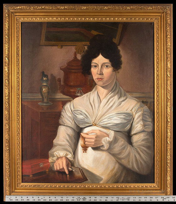
(Somehow, while often at events together, Drunk Tailor and I are rarely seen “together,” so images like this are nice to have.)

If you are going to play the tourist, especially if you are visiting the “spoils” of the former emperor, you have to dress appropriately. American tourists today may travel in camo crocs and backwards baseball caps, but people in the past dressed for touring and it seemed appropriate to dress for this trip.

Admiring the panorama. (Cropped only to enhance periodicity)

This trip, with the fun of visiting in period clothes, reminds me of the books still in storage, and the books I have yet to read — one on early country house tourism— that document the changes in how people spent their time and consumed goods, and the reasonably concurrent rise of both the museum and the department store.

Raptures about the mounting, I think, but we might as well we shopping.

Peale and Zola have more in common than you might think, or at least Mr. Peale and Mr. Selfridge. These compendia of material goods are similarly structured — both organized around themes or types, whether ladies’ lingerie or Oceanic art– and have similar aims of edification and [cultural] consumption.

When your hat sees its cousin in a case….

All in all, an excellent trip, with much to see and talk about. After finishing our tour of the Napoleon exhibit, we lunched (another experience similar to the department store) and toured more of the museum, and had a day well spent.

Share this:

  • Facebook
  • Pinterest
  • Email
  • Twitter

Like this:

Like Loading...

Black and White World

06 Friday Apr 2018

Posted by kittycalash in Clothing, Research

≈ 1 Comment

Tags

19th century clothing, art, art history, Fancy, Federal style, portraits, women

Isn’t she grand? She’s on offer elsewhere; I came across her while narrwing down a date for a very different portrait.

She reminds me of a Tamara de Lempicka, if Tamara and Ammi Phillips had set up easels next to each other. From her forthright, slightly sulky gaze to the exuberant folds of her gown bodice to the hints of style in the details, we can learn a lot from this painting. There’s a kind of provincial Hepplewhite sideboard behind her, set with a colorful garniture; the copper hot water or tea urn places us in a parlor. The painting frame has a shell in the center of the bottom rail, the chair a turned knob on the back upright– we are on the edge of fancy, the moment when neoclassicism really gives way to exuberance (think canary yellow rose-painted china, big puffy sleeves on printed gowns, and fancy-painted chairs).

Below, an earlier entry in the black and white world. This lady was sold at auction recently. She’s earlier than our near-Tamara above, plainer in dress, sulkier. She is certainly more academic, and somewhat better painted, in addition to being set in a vaguely classic scene, in a very neoclassical chair, draped with a fine shawl.The artists is definitely showing off some skill in the “painting transparency” department.

The lady in black is firmly set in the neoclassical period. Restraint and moderation are watchwords– despite what you may think of that hair, which is recalling Greco-Roman precedents–much the way certain factions in the Revolutionary period were driven by piety and discipline. Politics and national ethos or mood are embedded visual culture then as now, and even in these portraits, simple as they seem.

Share this:

  • Facebook
  • Pinterest
  • Email
  • Twitter

Like this:

Like Loading...

Cakes and Honey

03 Saturday Mar 2018

Posted by kittycalash in History, Living History, material culture, Research

≈ 1 Comment

Tags

art history, art supplies, newspapers, painting, watercolor, watercolors

Watercolor cakes: first invented by William Reeves in 1766 and sold in an improved form in 1780, watercolor cakes made painting easier then before. Colors still had to be ground in water to be used (that’s what the rectangular depression is for in the ceramic palette), but that was a step ahead of grinding the pigments with gum arabic yourself. Each pigment (usually a mineral, sometimes not) requires a specific amount of gum arabic, and in the 18th and early 19th century, both gum arabic and gum tragacanth were both used. In this era of experimentation, even gum hedera (from Hedera helix, or English ivy) was used, both as a diluent for animal glue size and in egg white varnish. The variation in gum types and amounts found in watercolor cakes and cake remains gives us an idea of how much experimentation and variation happened in the pre-industrial era of color production.

The Art of Drawing and Painting in Water-Colors, London: 1735.

Recipes (or receipts) were published beginning at least as early as 1730, with the promise of better, richer, and cheaper colors (qualities that did not always coexist easily). It’s not clear whether the watercolors sold in the American colonies were made locally or imported from Great Britain, but my best guess is that prepared watercolors (sold in shells and out of shells) were probably imported, if only because the sellers so often list many other goods.

Nicholas Brooks Ad, June 21, 1773 Pennsylvania Packet (Philadelphia).

How watercolors are sold evolves over time and varies by place: In 1771 Boston, John Gore, who specializes in artist’s materials at the Sign of the Painters Arms, offers “Water Colours ready prepar’d in Shells” in addition to a variety of artists’ pigments probably ground with different media to each artist’s specifications.

John Gore, Boston Evening Post, March 25, 1771.

Ten years later, Valentine Nutter, Stationer, offers “water colours in drops, shells, or galley pots,” suggesting that some cakes were prepared in ceramic pots or dishes (gallipots) and available in the United States by 1781. What the “drops, shells, or galley pots” looked like exactly is slightly conjectural: drop are probably corked bladders or bottles; shells are probably cockle shells (watercolor being concentrated means one wouldn’t need a cherrystone clam shell, let alone a quahog) but “galley pots” seem more elusive until you consider the Wedgwood paint chest.

blue and white jasper ware paint chest or box for moist watercolours: English, Staffordshire, Etruria, by Wedgwood, c. 1787. National Museum of Scotland, A.1893.84 A

The tiny pots that drop into the oval tray fall within the gallipot definition, and give us an idea of what Mr Nutter might have offered in his New York shop, filled with ground pigment, gum arabic, and a portion of honey to make the cakes re-wettable. Not every artist working in watercolor used honey, as recorded in a 1775 letter from John Singleton Copley to his mother, recording that “Mr. Humphrey tells me he uses no Shugar Candy in his colours.”

Share this:

  • Facebook
  • Pinterest
  • Email
  • Twitter

Like this:

Like Loading...

Kits, Boxes, Sticks, and All

22 Thursday Feb 2018

Posted by kittycalash in History, Living History, material culture, Research

≈ 2 Comments

Tags

art, art history, art supplies, material culture, painting, sketching, watercolor

Jens Juel, Self portrait at an easel. Oil on canvas, 1766. Royal Academy of Fine Arts, Denmark.

Once again, I’m looking into artists’ materials and techniques, though instead of trying to kit myself out for the early Federal era, I’m digging into the last half (quarter) of the 18th century. It seems to be a time of rapid transitions in art materials as new pigments and media are developed. While Mr. Juel is beginning a work in oils, we still see some of the same tools that a watercolorist would use. Brushes, though his are shaped for working in oil; a shell, perhaps to combine pigment with medium, and bags of paint.

Before collapsible tubes were invented in 1841, artists scooped or scraped pigments mulled with medium into skin bags, secured them with twine or string, and then poked a hole in the bag to extrude pigment. Some more clever sorts would plug the hole with a cork– untying the bag would make more of a mess than a distribution system– but otherwise, you risked having your paint dry before you could use it up. Clearly there were some inefficiencies built into the system. (I think it also helps explain why “thick” paintings, that is, paintings using exuberant and textured layers of paint, do not appear until after collapsible tubes are invented and in wide use.)

Matthew Pratt, The American School. oil on canvas, 1765. Metropolitan Museum of Art, Gift of Samuel P. Avery, 1897, 97.29.3

In Pratt’s American School, we can see how small the palettes are, and how small the dots of paint are compared to the pools where colors have been mixed. The easel, presented from another angle, offers clues to the adjustable pegs and triangular/tripod shape of the main support. But what of watercolors?

Winsor & Newton Old Paints: note the tiny bags of paint.

To date, I’ve found conservation reports more helpful than anything else, especially those analyzing paint content for sugars and gums. (One of the keys to watercolors was the re-wettable aspect of the colors; gum arabic, gum tragacanth and honey or sugar were ingredients used in varying proportions to achieve what we now take for granted.) The first watercolor cakes or blocks are introduced in 1780 by William Reeves; often, these were very hard, and had to be agitated in water (ground on a surface) to be used, much like sumi-e ink. Once paint was ground with water, it could be dried in a dish or container for re-wetting and later use. The question of course is, what do dry it in? How do you mix and use the paint?

Caroline Schetky Richardson’s Paint Box
about 1820–30. MFA Boston. 1995.156.1

Mixing is simpler to solve: a palette, of course. The small, dirty-looking oval in the image above is the ivory palette used by Caroline Schetky Richardson; while her box is 1820-1830, it’s still very similar to box in Charles Willson Peale’s portrait of his brother James (below). The box is 21 inches wide, 10 inches high, and 13 inches deep. That makes the palette something like 3 inches wide, if we take a drawer as five inches wide.

James Peale painting a miniature. Oil on canvas by Charles Willson Peale, 1795. Meade Art Museum, Amherst, MA

In the CWP portrait of JP, the slightly open drawer of the painting stand may be giving us a peek at his palette; the simple tumbler of water helps confirm that he is working in watercolor on ivory, and give us a sense of what kind of water container artists used– which, happily, can be more easily sourced than Mr Peale’s box.

Share this:

  • Facebook
  • Pinterest
  • Email
  • Twitter

Like this:

Like Loading...

Reading the Night

18 Monday Dec 2017

Posted by kittycalash in material culture, Research

≈ 3 Comments

Tags

art history, context, engravings, lithographs, prints, semiotics

Francois-Robert Ingouf after Sigmund Freudenberger (French, 1747 – 1812 ), La soiree d’hyver, 1774, etching and engraving, Rosenwald Collection 1943.3.4377

Details. It’s all in the details, right? I see this print multiple times every day, and contemplate the little stories in the details of the room.

Francois-Robert Ingouf after Sigmund Freudenberger (French, 1747 – 1812 ), La soiree d’hyver, 1774, etching and engraving, Rosenwald Collection 1943.3.4377

Perhaps the first thing I noticed that jarred my eye (and my thinking) was the row of glass vases for forcing bulbs. They look so modern, don’t they? But the shape is classic– form following function– and findable today. How pleasing that my mother’s winter ritual of filling windowsills and mantles with forcing bulbs can be visually documented to one of my favorite eras–and was, indeed, common in the past. This is one of those “everybody did it” ideas I can endorse.

French François Linke Louis XVI Style Gilt Bronze and White Marble Clock
Francois-Robert Ingouf after Sigmund Freudenberger (French, 1747 - 1812 ), La soiree d'hyver, 1774, etching and engraving, Rosenwald Collection 1943.3.4377
Francois-Robert Ingouf after Sigmund Freudenberger (French, 1747 – 1812 ), La soiree d’hyver, 1774, etching and engraving, Rosenwald Collection 1943.3.4377

What else is on the mantle? A clock, undoubtedly ormolu– though it could be much worse. And yes, the cupid on the clock has meaning in this print.

And then there’s this: the hot water urn– or is it?

Tucked into the fire place, I was initially pretty sure that’s a hot water/tea/coffee urn, meant to go with the tea or coffee cup on the mantle (see above; it’s in front of the bulb vases). Hot tea or coffee would be welcome on a cold winter’s evening, and the water would stay warmer tucked close to the fire.

Francois-Robert Ingouf after Sigmund Freudenberger (French, 1747 - 1812 ), La soiree d'hyver, 1774, etching and engraving, Rosenwald Collection 1943.3.4377
Francois-Robert Ingouf after Sigmund Freudenberger (French, 1747 – 1812 ), La soiree d’hyver, 1774, etching and engraving, Rosenwald Collection 1943.3.4377
Tea urn. Silver, by John Carter II. 1773-1774. Metropolitan Museum of Art, 11.28a–f

18th Century Cast and Wrought Iron Fireplace Fire Grate

But it could also be a decorative fender, ornamented with urns at the ends. The fireplace grate shown here is English, made ca. 1780 according to the seller) but should you have space cash burning a hole in your pocket, there’s a similar 19th century reproduction of the one in the print for sale on the interwebs, should you care to recreate this image (I know some of you have the clothes). In fact, there are quite few fenders-with-urns, once you start looking, some in bronze and some in steel.

And what of this? Is that an 18th century dog house or covered dog bed? Yes, it is.

Dog kennel, by Claude I Sené, 1775-1780. Metropolitan Museum of Art, 1971.206.18
R-20100527-0015.jpg

The bouillotte candlestand on the table is another nice household detail, illuminating a book lying open on the table set against the wall.

R-20100527-0015.jpg
Screenshot 2017-12-17 10.48.42

It has taken me some time of looking at period images to accept these candle stands as correct, since my experience with them was grounded in electrified reproductions in suburban Colonial Revival dens and family rooms– a location I will admit I was prejudiced against to begin with, having grown up in a city surrounded by architects devoted to (and buildings by) Mies van der Rohe.

But therein lies the point of looking: what initially seems absurd (Versailles-quality dog beds) or simply anachronistic (candlestands with shades) slides into place when seen and understood, within its proper context.

Share this:

  • Facebook
  • Pinterest
  • Email
  • Twitter

Like this:

Like Loading...
← Older posts

Kitty Calash FB

Kitty Calash FB

The Etsy Shop!

Kitty Calash Swag on Teespring

Archives

Enter your email address to follow this blog and receive notifications of new posts by email.

Join 1,928 other subscribers

Blogroll

  • A Most Beguiling Accomplishment
  • Afroculinaria: Michael Twitty
  • British Tars
  • Clothing the Carolinas
  • Drunk Tailor
  • History Research Shenanigans
  • Kleidung um 1800
  • New Vintage Lady
  • Not Your Momma's History
  • Our Girl History
  • Picking for Pleasure
  • Places in Time
  • Ran Away From the Subscriber
  • Slave Rebellion Reenactment
  • The Hidden Wardrobe
  • The Quintessential Clothes Pen
  • Worn Through

Etsy Shop

  • Kitty Calash on Etsy

Resources

  • Casey Fashion Plate Collection, LAPL

Sutlers

  • Burnley & Trowbridge
  • Wm Booth, Draper
wordpress statistics

Creative Commons License
Kitty Calash blog by Kirsten Hammerstrom is licensed under a Creative Commons Attribution-NonCommercial-ShareAlike 4.0 International License.

A WordPress.com Website.

  • Follow Following
    • Kitty Calash
    • Join 627 other followers
    • Already have a WordPress.com account? Log in now.
    • Kitty Calash
    • Customize
    • Follow Following
    • Sign up
    • Log in
    • Report this content
    • View site in Reader
    • Manage subscriptions
    • Collapse this bar
 

Loading Comments...
 

    %d bloggers like this: