• Home
  • Completed Costumes/Impressions
  • Emma and Her Dresses
  • Free Patterns and Instructions

Kitty Calash

~ Confessions of a Known Bonnet-Wearer

Kitty Calash

Tag Archives: art

Black and White World

06 Friday Apr 2018

Posted by kittycalash in Clothing, Research

≈ 1 Comment

Tags

19th century clothing, art, art history, Fancy, Federal style, portraits, women

Isn’t she grand? She’s on offer elsewhere; I came across her while narrwing down a date for a very different portrait.

She reminds me of a Tamara de Lempicka, if Tamara and Ammi Phillips had set up easels next to each other. From her forthright, slightly sulky gaze to the exuberant folds of her gown bodice to the hints of style in the details, we can learn a lot from this painting. There’s a kind of provincial Hepplewhite sideboard behind her, set with a colorful garniture; the copper hot water or tea urn places us in a parlor. The painting frame has a shell in the center of the bottom rail, the chair a turned knob on the back upright– we are on the edge of fancy, the moment when neoclassicism really gives way to exuberance (think canary yellow rose-painted china, big puffy sleeves on printed gowns, and fancy-painted chairs).

Below, an earlier entry in the black and white world. This lady was sold at auction recently. She’s earlier than our near-Tamara above, plainer in dress, sulkier. She is certainly more academic, and somewhat better painted, in addition to being set in a vaguely classic scene, in a very neoclassical chair, draped with a fine shawl.The artists is definitely showing off some skill in the “painting transparency” department.

The lady in black is firmly set in the neoclassical period. Restraint and moderation are watchwords– despite what you may think of that hair, which is recalling Greco-Roman precedents–much the way certain factions in the Revolutionary period were driven by piety and discipline. Politics and national ethos or mood are embedded visual culture then as now, and even in these portraits, simple as they seem.

Share this:

  • Facebook
  • Pinterest
  • Email
  • Twitter

Like this:

Like Loading...

Kits, Boxes, Sticks, and All

22 Thursday Feb 2018

Posted by kittycalash in History, Living History, material culture, Research

≈ 2 Comments

Tags

art, art history, art supplies, material culture, painting, sketching, watercolor

Jens Juel, Self portrait at an easel. Oil on canvas, 1766. Royal Academy of Fine Arts, Denmark.

Once again, I’m looking into artists’ materials and techniques, though instead of trying to kit myself out for the early Federal era, I’m digging into the last half (quarter) of the 18th century. It seems to be a time of rapid transitions in art materials as new pigments and media are developed. While Mr. Juel is beginning a work in oils, we still see some of the same tools that a watercolorist would use. Brushes, though his are shaped for working in oil; a shell, perhaps to combine pigment with medium, and bags of paint.

Before collapsible tubes were invented in 1841, artists scooped or scraped pigments mulled with medium into skin bags, secured them with twine or string, and then poked a hole in the bag to extrude pigment. Some more clever sorts would plug the hole with a cork– untying the bag would make more of a mess than a distribution system– but otherwise, you risked having your paint dry before you could use it up. Clearly there were some inefficiencies built into the system. (I think it also helps explain why “thick” paintings, that is, paintings using exuberant and textured layers of paint, do not appear until after collapsible tubes are invented and in wide use.)

Matthew Pratt, The American School. oil on canvas, 1765. Metropolitan Museum of Art, Gift of Samuel P. Avery, 1897, 97.29.3

In Pratt’s American School, we can see how small the palettes are, and how small the dots of paint are compared to the pools where colors have been mixed. The easel, presented from another angle, offers clues to the adjustable pegs and triangular/tripod shape of the main support. But what of watercolors?

Winsor & Newton Old Paints: note the tiny bags of paint.

To date, I’ve found conservation reports more helpful than anything else, especially those analyzing paint content for sugars and gums. (One of the keys to watercolors was the re-wettable aspect of the colors; gum arabic, gum tragacanth and honey or sugar were ingredients used in varying proportions to achieve what we now take for granted.) The first watercolor cakes or blocks are introduced in 1780 by William Reeves; often, these were very hard, and had to be agitated in water (ground on a surface) to be used, much like sumi-e ink. Once paint was ground with water, it could be dried in a dish or container for re-wetting and later use. The question of course is, what do dry it in? How do you mix and use the paint?

Caroline Schetky Richardson’s Paint Box
about 1820–30. MFA Boston. 1995.156.1

Mixing is simpler to solve: a palette, of course. The small, dirty-looking oval in the image above is the ivory palette used by Caroline Schetky Richardson; while her box is 1820-1830, it’s still very similar to box in Charles Willson Peale’s portrait of his brother James (below). The box is 21 inches wide, 10 inches high, and 13 inches deep. That makes the palette something like 3 inches wide, if we take a drawer as five inches wide.

James Peale painting a miniature. Oil on canvas by Charles Willson Peale, 1795. Meade Art Museum, Amherst, MA

In the CWP portrait of JP, the slightly open drawer of the painting stand may be giving us a peek at his palette; the simple tumbler of water helps confirm that he is working in watercolor on ivory, and give us a sense of what kind of water container artists used– which, happily, can be more easily sourced than Mr Peale’s box.

Share this:

  • Facebook
  • Pinterest
  • Email
  • Twitter

Like this:

Like Loading...

Rethinking Reenacting Redux

22 Saturday Apr 2017

Posted by kittycalash in Art Rant, Living History, personal, Philosophy, Reenacting

≈ 2 Comments

Tags

art, authenticity, interpretation, living history, Reenacting, transcendence

Some of you may recall my friend from the antediluvian age, Dread Scott. He was in town briefly and while I wasn’t able to attend his talk, I got my own special artist’s talk over breakfast.

Scott’s working on a Slave Rebellion Reenactment, (additional info here) so we had a lot to talk about.

Scuffle in the Square, Princeton, 2017. Photo by Wilson Freeman at Drifting Focus Photography

He had some great questions about what we do, and why we do it, especially around Princeton, and in talking about my end goal (getting the public to understand how the past informs the present), I said something about how in Newport in 2014, the cars disappeared and we forgot we were in the present.

Scott’s great reply was about keeping the present present, occupying two time periods simultaneously, to recognize that the past made the present. I know that seems obvious, but it isn’t always when we’re out in our funny clothes. It’s another layer of interpretation that we can build onto our reenactments and recreations, particularly when we are trying to talk about slavery. Slavery built the institutions we have today– like Aetna Insurance and Georgetown University– so if we acknowledge our surroundings in a place like downtown Princeton or Newport, we can talk about more than just the moment we are recreating.

Some of us seek historical transcendence. Some of us enjoy a social experience. And some of us seek ways to connect the present to the past in ways that help us understand how we got here, and how to make a better future.

The more I contemplate what matters to me, the more I think I’m seeking that last more than I am even transcendence.

Share this:

  • Facebook
  • Pinterest
  • Email
  • Twitter

Like this:

Like Loading...

What’re you lookin’ at?

23 Tuesday Aug 2016

Posted by kittycalash in Art Rant, Living History, Reenacting, Research

≈ 5 Comments

Tags

art, art history, fashion, interpretation, semiotics

Pupils of Nature.hand-colored etching published by S W Fores after Maria Caroline Temple, 1798. British Museum, 1867,0713.409

Pupils of Nature.hand-colored etching published by S W Fores after Maria Caroline Temple, 1798. British Museum, 1867,0713.409

No, really: Do you know what you are looking at?

When we set out to make historic clothing and costumes, it’s important to understand our sources. Newspaper advertisements and account books are one source of information that can be difficult to decode: from Swankskin to Tammies to Shalloons, Nankeens, and Calimancos, we encounter words we do not understand. Dictionaries can help, but it is as well to remember that we need that help decoding the words.

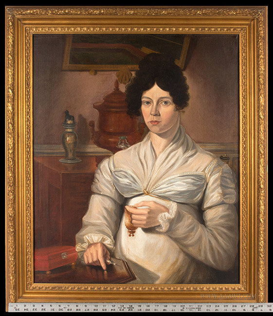
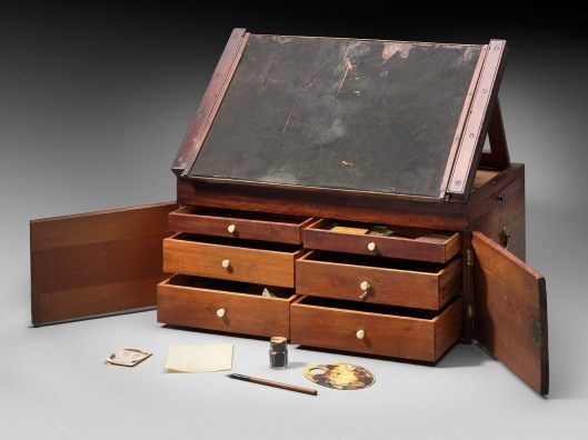
We don’t get the same handy, universal guidebook in quite the same way when we look at extant garments. What we do often get is provenance. Knowing a garment’s history is essential to truly understanding it. It helps date the item, for one thing, and understanding the history of the wearer gives us even more information about the clothing. How old was the person when this was worn? What was their social status? Income level? And if there are mends and alterations: even better!

I came to understand the family who lived in the house where I work more clearly through their clothes. Muslin waistcoat fronts that, on examination, are not truly out of the tippy-top drawer helped me see the Big Fish/Small Pond nature of the family and their wealth. You may be a Playa in backwater Providence, but you Just Another Guy in Philly. It was a little window into the insecurities of the father, and how those played out in his reaction to his daughters’ marriages.

The Unfortunate Beau, etching, Publish'd as the Act directs 12th Sept 1772, by S.Hooper, No.25 Ludgate Hill. British Museum 1991,1214.20

The Unfortunate Beau, etching, Publish’d as the Act directs 12th Sept 1772, by S.Hooper, No.25 Ludgate Hill. British Museum 1991,1214.20

But (in the grand scheme of things) there are only so many newspaper ads and account books and few enough garments, let alone the zebras of garments with solid provenance. The groups are smaller still when you consider relevance to what you need or want to know or replicate. Small state? You’ll have a small pool.

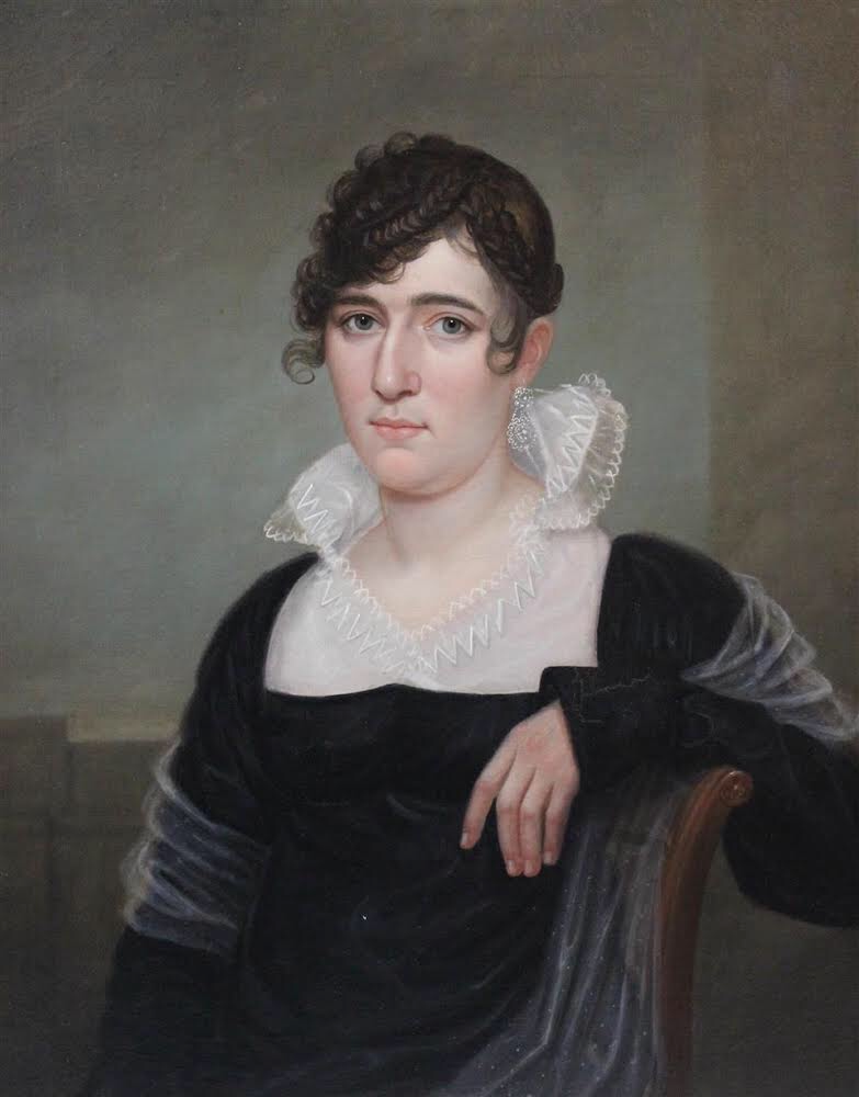
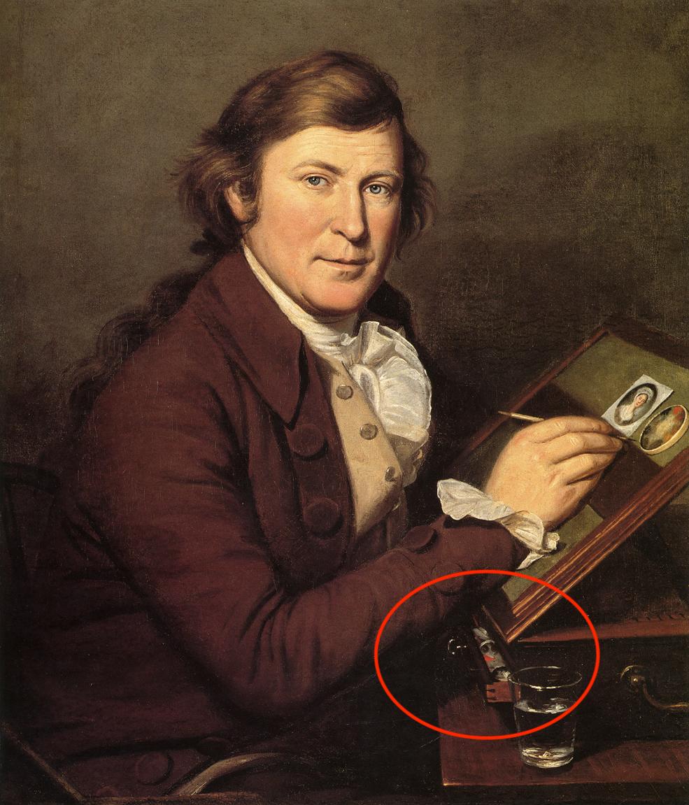
So we turn, often, to images. Here again, provenance is helpful when we look at a portrait. Even knowing the maker is helpful: Ralph Earl or James Earl? Portraits by brother James aren’t the same level as those by Ralph, so you get a different kind of information. But that’s all quite aside from what’s contained within the image– and that’s even before you begin to consider what you are doing when you replicate the image.

Understanding the symbols and meanings of images and objects is slightly esoteric but questioning your sources (Interrogating the Object, if you will) allows you to better understand what the heckers you are doing and how it may be perceived. In the pursuit of historical clothing, living history and reenacting, that is more important than we credit. Do we really know what the sources mean? I’ve argued before that we don’t-– and that doesn’t mean DON’T it means USE WITH CAUTION. We’re long removed from the details of, say, satirical engravings that lack a literary source, so those need especial caution as sources. We lack the context.

The Bargain Struck, or Virtue conquer'd by Temptation. Mezzotint, 1773. British Museum 1935,0522.1.130

The Bargain Struck, or Virtue conquer’d by Temptation. Mezzotint, 1773. British Museum 1935,0522.1.130

Now, if your goal is straightforward: replicating costume for fun, say, you will care less about the notion of meaning within images than someone who is trying to understand the past by inhabiting the clothing with the hope of gaining insight into the worldview of the past. That second category is possibly a more tortured group of souls than the first, laboring as we do at an impossible task.

We are talking about semiotics here, and if you want a quick intro, The Signs of Our Time by Jack Solomon, PhD clocks in at 244 pages including bibliography. It’s old– 1988– and perhaps oversimplified, but we’re not in graduate seminar here, so it will do for our purposes. Solomon’s book contains a handy list he calls the Six Principles of Semiotics:

  1. Always question the “common sense” view of thing, because “common sense” is really “communal sense”: the habitual opinions and perspectives of the tribe.
  2. The “common sense” viewpoint is usually motivated by a cultural interest that manipulates our consciousness for ideological reasons.
  3. Cultures tend to conceal their ideologies behind the veil of “nature,” defining what they do as “natural” and condemning contrary cultural practices as “unnatural.”
  4. In evaluating any system of cultural practices, one must take into account the interests behind it.
  5. We do not perceive our world directly but view it through the filter of a semiotic code or mythic frame.
  6. A sign is a sort of cultural barometer, marking the dynamic movement of social history.

Now that you’ve read the list, perhaps what I obsess about will be clearer: we don’t fully understand the culture of the past. We don’t have the same semiotic or mythic filter than the people of the 18th century had, but when we recognize first that they had a filter, and second that the filter varied from culture to culture, we can better understand our sources.

If you can accept that the cultural filters of England and France and the United States were all different, perhaps it will be easier to accept that you cannot mimic a French fashion plate in portraying a middle-class New England woman without encountering some questions. But if you replicate that fashion plate for the pleasure of experiencing that fashion moment, that’s another game altogether.

Intention matters. Your goal will dictate your sources, and how you use them. As committed as I am to the everyday (because no one is documenting us or saving us, no matter how desperately we try to signal our being with Facebook and Instagram posts), I’m not suggesting that we all attempt to recreate the same past. I’m arguing that we strive to understand what we are doing (dressing up, portraying a specific character, portraying an archetype) and that when we know what we are doing, we understand better how to use the sources we have.

Share this:

  • Facebook
  • Pinterest
  • Email
  • Twitter

Like this:

Like Loading...

Fine Art Friday

20 Friday May 2016

Posted by kittycalash in History, Living History, Research

≈ Comments Off on Fine Art Friday

Tags

19th century clothing, art, art history, fine art, history, interpretation, sewing, sketchbook, sketching, women's history

Sketching a Cottage, Sept 29, 1816. Watercolor by Diana Sperling

Sketching a Cottage, Sept 29, 1816. Watercolor by Diana Sperling

In a mere four weeks, I will pack the Subaru and head west into New York State as so many Rhode Islanders have before me. And while I will have clothes suitable for the time of the RI Quaker Migration, I will be leaving not to found a more utopian society nor to seek my fortune on a farm. Instead, I’ll be joining some dear friends for a weekend sketching party (minus the horse and carriage).

This new enterprise has required some additional research, and while I look forward to painting miniatures at some point this summer, I suspect this venture will be a simpler proposition. A new dress and apron are the least of my worries: brushes, watercolor boxes, sketchbooks, pencils and pens all require research just when I should be thinking more seriously about the way the Revolution played out as a civil war in New Jersey.

Anne Rushout, ca. 1768–1849, British, 3 sketchbooks of 82 drawings by Anne Rushout (B1977.14.9506-9587), 1824 to 1832, Watercolor on moderately thick, slightly textured, cream wove paper, Yale Center for British Art, Paul Mellon Collection

Anne Rushout, ca. 1768–1849, British, 3 sketchbooks of 82 drawings by Anne Rushout (B1977.14.9506-9587), 1824 to 1832, Yale Center for British Art, Paul Mellon Collection

Still, the Yale Center for British Art has rarely failed me: a simple search for sketchbook turned up a catalog record for three sketchbooks of 82 drawings by Anne Rushout. These are lovely, well-executed landscapes in a fine British tradition, far more sophisticated than Diana Sperling or Sophie DuPont– I fear I will closer to Sperling and DuPont when I take up sketching again, and can at least console myself that my wonky drawings will be part of a fine tradition of ladies’ accomplishments.

Man and cat, 2004

Man and cat, 2004

The Yale Center for British Art also has a nice Romney sketchbook for Paradise Lost, which demonstrates the cartoon-like nature of preliminary drawings (and I mean cartoon in the old sense, not the Animaniacs sense, though the uses are related). And as I sew my dress of unmatched checks, I have art programming to entertain me: Fake or Fortune, thanks to a tip from Ms B, has provided happy, envious hours of conservation labs, artists’ colourmen, and auction rooms. Vicarious delight, indeed.

Share this:

  • Facebook
  • Pinterest
  • Email
  • Twitter

Like this:

Like Loading...
← Older posts

Archives

wordpress statistics

Creative Commons License
Kitty Calash blog by Kirsten Hammerstrom is licensed under a Creative Commons Attribution-NonCommercial-ShareAlike 4.0 International License.

Website Built with WordPress.com.

  • Follow Following
    • Kitty Calash
    • Join 619 other followers
    • Already have a WordPress.com account? Log in now.
    • Kitty Calash
    • Customize
    • Follow Following
    • Sign up
    • Log in
    • Report this content
    • View site in Reader
    • Manage subscriptions
    • Collapse this bar
 

Loading Comments...
 

    %d bloggers like this: