• Home
  • Shop
  • Completed Costumes/Impressions
  • Emma and Her Dresses
  • Patterns & Kits
  • Free Patterns and Instructions

Kitty Calash

~ Confessions of a Known Bonnet-Wearer

Kitty Calash

Category Archives: Art Rant

Pilgrimage

13 Wednesday Feb 2019

Posted by kittycalash in Art Rant, material culture, Museums

≈ 1 Comment

Tags

Kehinde Wiley, material culture, Museums, National Portrait Gallery, Obama Portraits

Former President Barack Obama Oil on canvas by Kehinde Wiley, 2018. National Portrait Gallery (Washington, D.C.)

Note: This was written some weeks before the Kim Sajet’s piece in The Atlantic appeared. Upon reading that, I decided to publish this essay.

Kehinde Wiley’s official portrait of President Obama hangs on a partial wall fronted by a velvet rope. Stanchions create an approach to the portrait, and people are lined up as if they’re waiting for communion, waiting to approach an altar. Which they are. The portrait is more vivid, more alive, in person than in print or online. The line of people–still long, still rapt, months after the painting was installed– is as moving as the portrait itself.

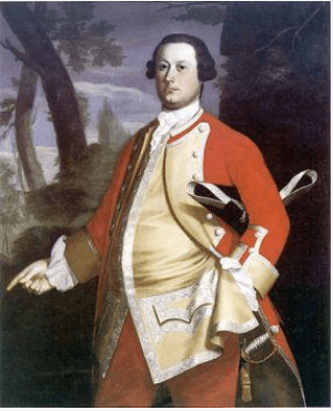
I knew I would like the portrait because I like the artist. The first Wiley I saw was at the MFA Boston, John, 1st Baron Byron hangs in a long hallway of a gallery, the chinoiserie background red and vibrant, loud the way 18th century wallpaper could be. Tendrils wrap around the subject’s legs, flat against the navy blue chinos, and without regard to the light that reflects from his palm. It stopped me in my tracks.

John, 1st Baron Byron. oil on canvas by Kehinde Wiley. Museum of Fine Arts, Boston.2013.633

Obama’s portrait pricked my eyes with tears, not only for what I missed– the cool intelligence, the restraint, the reasonable domestic policies–but for the line of supplicants. There was a crowd of people who were moved the way I was moved, by the representation of a person. They were moved because of what the painting stood for, and how it represented the embodiment of an idea.

Shepard Fairey’s “Hope” portrait collage captures the beginning of the idea, Wiley’s portrait the mature realization. A copy of Fairey’s 2008 poster hung in my Providence living room, flatter than the original collage, stylized to a near caricature. Wiley’s portrait would suffer as a poster, print rendering the floral background lifeless, draining it of the light that saturates the portrait in person. The portrait glows on the gallery wall: Wiley has captured “hope” in paint and made it feel alive.

HOPE, by Shepard Fairey. Screenprint, 2008.

That light and life captivate viewers and draw them to the painting; they respond not only to what they know it represents, but to how the idea and accomplishment are represented. Watching people get in line to see a painting– no other presidential portrait, no other portrait, captured people’s attention and interest this way– proves not the popularity of a past president but the power of an object.

Wiley’s portrait, suffused with light, may be a modern altarpiece to the cult of celebrity, drawing crowds to worship an idol created by the media. Or it may be the physical representation of quintessentially American ideals of equality and progress, depicting a god of the mythical post-racial present. Or perhaps it’s a superficial representation of a superficial success, thin paint to match a thin pre-presidential resume. How we interpret an object is colored by our biases, but our response is not: our response is intuitive and automatic. That’s what I see in the queue to view Wiley’s portrait: people responding instinctively to beauty.

Sometimes I forget that no matter how interpretation and meaning layer an object, the first response is instinctive. It may be so fast we (almost) miss it, an impulse leaping across a synapse, but it is often the most honest response; the one we need to pay attention to so we can better understand how an object is presented to us or the public. The power is intrinsic to the object, whether an inlaid table or a portrait: the maker speaks to us through the object. Wiley’s portrait and the crowd who came to see it reminded me of that basic truth: the power is in the object. A curator’s label and presentation are secondary to the immediate response of the viewer to the object. There’s nothing like the real thing.

Share this:

  • Facebook
  • Pinterest
  • Email
  • Twitter

Like this:

Like Loading...

The Stuff of Life

07 Tuesday Nov 2017

Posted by kittycalash in Art Rant, Collecting, material culture, personal

≈ Leave a comment

Tags

art history, collections, interpretation, material culture, meaning, objects, provenance

We all love things, don’t we? Things in the literal, corporeal, piled-in-a-heap sense: plates, shoes, books, chairs, necklaces, models. But what makes us love them? How deeply do we really love them?

Someone posed the questions, What would you take if you had to pack in a hurry to leave home forever? What will your kids remember you by?

Those are hard to unpack: how will other people remember us? Often, we have no idea what we mean to other people, even the ones closest to us. It’s easier for me to know what I would take or keep to remember someone else by– a single sleeve link; a wooden train engine; a stainless steel spoon; a necklace of handmade beads. None of those things reflects what is truly meaningful to me about them, that is, without my knowledge, these aren’t particularly interesting or aesthetic objects. What makes them special is the story I attach to them.

That is, of course, the key to interpreting objects in a social history context: the story is what makes the object more interesting, more important, more compelling. It’s the difference between a provenanced and an unprovenanced object, between a roundabout (or corner) chair in context, and one out of context.

Corner chair, probably John Goddard. Metropolitan Museum of Art, L2014.9.1a,b Lent by the Wunsch Collection, 2014

This is not to say that beautiful things are without value removed from context, but what makes that Goddard chair more compelling is knowing who made it, who it was made for, and when– knowing that it was part of a set of furniture ordered to furnish a house for Providence newlyweds, made in Newport by one of the hottest makers of the time. It’s the people who make the object more interesting, who make it worth having, seeing, holding on to– whether it’s a $6 million chair or a $25 mug, memories and stories make things compelling beyond our associations with them.

Part of a museum curator’s job is understanding those stories, placing objects in context, and connecting them back to their stories, to their makers, users, owners, and keepers. We may buy things because they’re beautiful or useful, but often we keep them because of their meaning– which is, more often than not, about people. Unprovenanced objects have less meaning; an object sold outside, or without, its context will not fetch as much. Value resides in people, not in things.

I think of this not only because a portion of my work is to recreate or reestablish the human contexts and connections for things, but because there is a human instinct to grab onto something tangible (like an object), rather than something ethereal (like a memory), even though what will sustain us in the end is not things, but other people, and our memories of them.

Share this:

  • Facebook
  • Pinterest
  • Email
  • Twitter

Like this:

Like Loading...

A Vision in Vermillion

22 Friday Sep 2017

Posted by kittycalash in Art Rant, Book Review, Clothing, History

≈ 3 Comments

Tags

18th century clothing, american art history, art history, British Army, fine art, John Copley, uniforms

Lt. Joshua Winslow, oik on canvas by John Singleton Copley, 1755. Santa Barbara Museum of Art.

Or scarlet, as the case may be.

I’m reading Jane Kamensky’s “A Revolution in Color: The World of John Singleton Copley,” and just 56 pages in, I’m annoyed.

Writing about Copley’s success at painting military officers during the 7 Years War, currently at the Santa Barbara Museum of Art, though not online, Kamensky says of the 1755 portrait of Joshua Winslow:

“Hanging in his quarters at Fort Lawrence, Winslow’s portrait in uniform would have served as a subtle reminder of his valuable connections. Copley’s three-quarter-length portrait lavishes attention on the young officer’s silver lace and pulsing red coat, a uniform more elaborate than the one he likely wore. The painter seemingly delights in the play of light upon shining surfaces, from the buff-colored sateen pulled taut across Winslow’s ample waist to the golden braid and tassel dangling from his silver-hilted sword.” (pp 56-57; emphasis added.)

1760-65 Uniform of Captain Thomas Plumbe of the Royal Lancashire Militia.

I missed that bit about sateen last night when I read this aloud to Drunk Tailor, so let’s roll back to the part that first set me off: the young officer’s silver lace and pulsing red coat, a uniform more elaborate than the one he likely wore.

Ahem.

Here’s the 1760-65 uniform of the 1st Royal Lancashire Militia as worn by Captain Thomas Plumbe.  “The oldest, most complete, British army uniform in the world, similar to the pattern worn at the Battle of Culloden in 1746 and in the Wars of American Independence.”

Granted, Plumbe’s uniform is later than Winslow’s portrait, and Plumbe was a Captain and Winslow a Lieutenant, but the difference between them is rather less than, say, a private and a captain. Why does Kamensky assume that Winslow’s uniform is not the one he wore? Is it the lace? Winslow held a commission, and served as paymaster and commissary, roles Kamensky describes as “relatively modest.” Yes, Lieutenant isn’t Colonel; it’s the baby of officers, but it’s still commissioned officer and reasonably responsible (and, one might imagine, relatively remunerative if one was hooked into the Boston mercantile network). And uniforms were ornamented with tape, in gold, silver, or wool– see below, in Morier’s painting of two privates. (I further wonder whether it’s reasonable to describe a portrait of 50″ x 40″ as subtle, but perhaps it was placed in an enormous room.)

Privates, 119th (Prince’s Own) Regiment of Foot, 1762-3. Oil on canvas by David Morier. RCIN 406873 Royal Collection Trust/© Her Majesty Queen Elizabeth II 2017

From Winslow, Kamensky moves to Brattle. “As his personal, military, and commercial fortunes rose in tandem, Brattle commissioned Copley to portray him in a fanciful uniform nearly identical to the one in Joshua Winslow.” (p 58 emphasis added)

William Brattle, oil on canvas by John Singleton Copley, 1756. Harvard Art Museums/Fogg Museum, Partial Gift of Mrs. Thomas Brattle Gannett and Partial Purchase through the generosity of Robert T. Gannett, an Anonymous Donor and the Alpheus Hyatt Purchasing Fund 1978.606

Fanciful? Fancy to our eyes, yes. Fanciful, no. Brattle was eventually a Major-General, so the uniform portrayed here, when he was likely a captain (same rank as Plumbe), seems pretty reasonable. If we were considering replicating a Massachusetts officer’s uniform ca 1755, we would consider Brattle and Winslow’s biographies and ranks, compare the two portraits of two men, probably both captains at this time, and, cross-referenced with Plumbe’s amazingly extant uniform and the 1751 warrant, begin to form an opinion that we would be making a coat in scarlet superfine broadcloth faced with buff, with buff small clothes, gold tape, and domed buttons. (Sateen is a weave structure, and wool sateen was not used in military uniforms.)

But that’s now how Kamensky is approaching this, of course, and why would she? She’s a historian, not a curator, material culture person, or a reenactor. Why does she assert that the uniforms worn by Winslow and Brattle are fanciful, and “more elaborate” than what they wore– without a footnote to back that assertion? And why does she then describe Major George Scott’s portrait “as the meticulously rendered uniform of his parent regiment, The Fortieth Foot” in contrast to “the fanciful, half-imagined costumes of Winslow and Brattle”? (p 58)

Major George Scott (detail), oil on canvas by John Singleton Copley, 1755-58. Private Collection

The sitters’ biographies are footnoted, but nothing appears in the notes about the uniforms. Kamensky makes a great leap to the “fanciful,” which I find curious, considering that most male portraits are rendered carefully if flatteringly, and many female portraits are made for the male gaze, and are more likely to be “fanciful” or “fancy dress.”

Grenadiers, 40th Regiment of Foot, and Privates, 41st Invalids Regiment and 42nd Highland Regiment, 1751. Oil on canvas by David Morier, 1751. RCIN 405589 Royal Collection Trust/© Her Majesty Queen Elizabeth II 2017

We are fortunate to have the David Morier image of a grenadier of the 40th to compare with the slightly later Scott portrait; I like the grenadier’s belly box, which appears on the left of Scott’s portrait and is described by Kamensky as “”tricked out for foul-weather fighting.” (p 59) Did I miss something? Were belly boxes and cartridge boxes once flap-free? I stumble over “tricked out,” too, which seemed to betray a particular lack of interest in understanding what Copley was portraying.

I find myself wondering how it is that historians and art historians can write so confidently about images without understanding the material depicted. It’s as if they are all context and no content, while many reenactors/costumers favor content over context. In any case, having encountered these speed bumps in the book, I’ll certainly be reading it with a dose of skepticism when portraits are dissected.

Adam Stephen’s Waistcoat and Gorget
Date: ca. 1754
Catalog #: 12197; 12199 gorget Accession #: 52984
Credit: Division of Military History and Diplomacy, National Museum of American History

Edited to add: Drunk Tailor reminded me after I posted this that the NMAH possesses an actual officer’s waistcoat from the 1750s. Here’s the General History note in the online exhibit: “In 1755, the officers of the Virginia Regiment received orders from Washington to provide themselves with a “Suit of Regimentals” of good blue cloth. The coat was to be faced and cuffed in scarlet and trimmed with silver; they were to wear blue wool breeches and a scarlet wool waistcoat with silver lace.”

Scarlet wool waistcoat with silver lace. Sure does resonate with those portraits of Winslow and Brattle, and makes me all the more uncomfortable Kamensky’s assertions of “fanciful” depictions.

Share this:

  • Facebook
  • Pinterest
  • Email
  • Twitter

Like this:

Like Loading...

Everything Old is New Again

19 Wednesday Jul 2017

Posted by kittycalash in Art Rant, Living History, Museums

≈ Leave a comment

Tags

18th century, common soldier, interpretation, living history, Museums, Revolutionary War

I could be making bonnets. I could be applying for moar jobz. I could be finishing the soup that’s on the stove. But instead, I’m annoyed by a museum’s social media posting. For the sake of all that’s holy in history, is there nothing more to an 18th century soldier’s life than his weapon? Now, to the museum’s credit, only 50% of the posted images could truly be said to focus on the musket or some musket-related tool.

But what’s so damned annoying is that the organization in question, all brand-spanking new and on everybody’s “must-see” list, falls back on the same old tropes on social media, which makes me want to know more about their educational mission. If the social media message continues to reinforce the same messages (guns are important) instead of expanding to include a soldier’s daily life, or even his inner life, the public has trouble moving past that simple message to ask more questions.

Museums and their representatives cue the questions visitors ask by framing objects, writing labels, even aiming the lights, to focus on what the museum believes is important. Put guns front and center, that’s what the questions will be about instead of about hygiene, clothing, literacy, or diet.

This image got me really excited, until I read the caption.

“Brick dust for polishing the brass elements on his weapon.” Dammit! It’s not tooth powder!

I understand full well that the museum’s interpretation of our national founding is far more inclusive than many museum visitors have previously encountered. I understand that the educational program currently lacks a permanent director, and is not yet fully fleshed out.

Museums are among the most trusted sources for information. Presentation matters. What museums emphasize matters. If museums — in their exhibits, programs, or marketing– continue to “give the people what they want,” the people will not know that they can want something different, or even that there is something different to want. Inclusivity is constant: in the galleries, in the labels, in the programming, in the staff, and in the marketing (which this museum did, in fact, do, masterfully, at a major train station).

But I’m picking on them for this post because they are the top of the game right now, and if they can do better in the galleries and in the train station, they can do better on social media. They’ve had some of the best female interpreters around working this month and the end of last, and yet the first social media post on that program is of a soldier, and focuses on his weapon. The past– and the present– deserve better.

Share this:

  • Facebook
  • Pinterest
  • Email
  • Twitter

Like this:

Like Loading...

Rethinking Reenacting Redux

22 Saturday Apr 2017

Posted by kittycalash in Art Rant, Living History, personal, Philosophy, Reenacting

≈ 2 Comments

Tags

art, authenticity, interpretation, living history, Reenacting, transcendence

Some of you may recall my friend from the antediluvian age, Dread Scott. He was in town briefly and while I wasn’t able to attend his talk, I got my own special artist’s talk over breakfast.

Scott’s working on a Slave Rebellion Reenactment, (additional info here) so we had a lot to talk about.

Scuffle in the Square, Princeton, 2017. Photo by Wilson Freeman at Drifting Focus Photography

He had some great questions about what we do, and why we do it, especially around Princeton, and in talking about my end goal (getting the public to understand how the past informs the present), I said something about how in Newport in 2014, the cars disappeared and we forgot we were in the present.

Scott’s great reply was about keeping the present present, occupying two time periods simultaneously, to recognize that the past made the present. I know that seems obvious, but it isn’t always when we’re out in our funny clothes. It’s another layer of interpretation that we can build onto our reenactments and recreations, particularly when we are trying to talk about slavery. Slavery built the institutions we have today– like Aetna Insurance and Georgetown University– so if we acknowledge our surroundings in a place like downtown Princeton or Newport, we can talk about more than just the moment we are recreating.

Some of us seek historical transcendence. Some of us enjoy a social experience. And some of us seek ways to connect the present to the past in ways that help us understand how we got here, and how to make a better future.

The more I contemplate what matters to me, the more I think I’m seeking that last more than I am even transcendence.

Share this:

  • Facebook
  • Pinterest
  • Email
  • Twitter

Like this:

Like Loading...
← Older posts

Kitty Calash FB

Kitty Calash FB

The Etsy Shop!

Kitty Calash Swag on Teespring

Archives

Enter your email address to follow this blog and receive notifications of new posts by email.

Join 1,928 other subscribers

Blogroll

  • A Most Beguiling Accomplishment
  • Afroculinaria: Michael Twitty
  • British Tars
  • Clothing the Carolinas
  • Drunk Tailor
  • History Research Shenanigans
  • Kleidung um 1800
  • New Vintage Lady
  • Not Your Momma's History
  • Our Girl History
  • Picking for Pleasure
  • Places in Time
  • Ran Away From the Subscriber
  • Slave Rebellion Reenactment
  • The Hidden Wardrobe
  • The Quintessential Clothes Pen
  • Worn Through

Etsy Shop

  • Kitty Calash on Etsy

Resources

  • Casey Fashion Plate Collection, LAPL

Sutlers

  • Burnley & Trowbridge
  • Wm Booth, Draper
wordpress statistics

Creative Commons License
Kitty Calash blog by Kirsten Hammerstrom is licensed under a Creative Commons Attribution-NonCommercial-ShareAlike 4.0 International License.

A WordPress.com Website.

  • Follow Following
    • Kitty Calash
    • Join 627 other followers
    • Already have a WordPress.com account? Log in now.
    • Kitty Calash
    • Customize
    • Follow Following
    • Sign up
    • Log in
    • Report this content
    • View site in Reader
    • Manage subscriptions
    • Collapse this bar
 

Loading Comments...
 

    %d bloggers like this: