• Home
  • Completed Costumes/Impressions
  • Emma and Her Dresses
  • Free Patterns and Instructions

Kitty Calash

~ Confessions of a Known Bonnet-Wearer

Kitty Calash

Category Archives: material culture

I Want [peppermint] Candy

10 Wednesday Oct 2018

Posted by kittycalash in Clothing, Living History, Making Things, material culture

≈ 1 Comment

Tags

18th century clothes, 18th century clothing, bonnets, cotton print, milliner, millinery, reproduction, wrapping gown

A friend regularly sends me bonnet descriptions from the inventories she’s researching; one description was of a white silk bonnet with a red cherry silk lining from Rowan County, N.C. in the 1770s. Hot stuff, right? Less hot if you made it in white linen, but even North Carolina has winter sometimes. I made two, of course, in sightly different shapes.

Bonnet Number One

Strawberry shortcake? Whipped cream and cherries? You tell me, but I always maintain that bonnets are the cupcakes of costuming: pretty, fluffy, low-calorie and quick to make. 

Once she’d sent me the description, I got hung up on finally finishing my wrapping gown. 

There are enough events where I sleep over that a wrapper for the morning is a useful thing. My characters don’t rate the silk of the one I made for Potts Grove Manor, but I used the same pattern with a reproduction cotton print from Burnley & Trowbridge. I love it– but I do feel a bit like a candy cane. 

Bonnet Number Two, Lampshade Style

Because I’ve seen so many instances of sun shade bonnet (herein known as “lampshade,” making one up in that form seemed like a good idea– and the crowning glory to the red and white striped wrapper. 

Now I really need a cherry red silk quilted petticoat to wear with this ensemble. Some other autumn, when I have more space and time perhaps. 

Share this:

  • Click to share on Facebook (Opens in new window) Facebook
  • Click to share on Pinterest (Opens in new window) Pinterest
  • Click to email a link to a friend (Opens in new window) Email
  • Click to share on X (Opens in new window) X
Like Loading...

Cakes and Honey

03 Saturday Mar 2018

Posted by kittycalash in History, Living History, material culture, Research

≈ 1 Comment

Tags

art history, art supplies, newspapers, painting, watercolor, watercolors

Watercolor cakes: first invented by William Reeves in 1766 and sold in an improved form in 1780, watercolor cakes made painting easier then before. Colors still had to be ground in water to be used (that’s what the rectangular depression is for in the ceramic palette), but that was a step ahead of grinding the pigments with gum arabic yourself. Each pigment (usually a mineral, sometimes not) requires a specific amount of gum arabic, and in the 18th and early 19th century, both gum arabic and gum tragacanth were both used. In this era of experimentation, even gum hedera (from Hedera helix, or English ivy) was used, both as a diluent for animal glue size and in egg white varnish. The variation in gum types and amounts found in watercolor cakes and cake remains gives us an idea of how much experimentation and variation happened in the pre-industrial era of color production.

The Art of Drawing and Painting in Water-Colors, London: 1735.

Recipes (or receipts) were published beginning at least as early as 1730, with the promise of better, richer, and cheaper colors (qualities that did not always coexist easily). It’s not clear whether the watercolors sold in the American colonies were made locally or imported from Great Britain, but my best guess is that prepared watercolors (sold in shells and out of shells) were probably imported, if only because the sellers so often list many other goods.

Nicholas Brooks Ad, June 21, 1773 Pennsylvania Packet (Philadelphia).

How watercolors are sold evolves over time and varies by place: In 1771 Boston, John Gore, who specializes in artist’s materials at the Sign of the Painters Arms, offers “Water Colours ready prepar’d in Shells” in addition to a variety of artists’ pigments probably ground with different media to each artist’s specifications.

John Gore, Boston Evening Post, March 25, 1771.

Ten years later, Valentine Nutter, Stationer, offers “water colours in drops, shells, or galley pots,” suggesting that some cakes were prepared in ceramic pots or dishes (gallipots) and available in the United States by 1781. What the “drops, shells, or galley pots” looked like exactly is slightly conjectural: drop are probably corked bladders or bottles; shells are probably cockle shells (watercolor being concentrated means one wouldn’t need a cherrystone clam shell, let alone a quahog) but “galley pots” seem more elusive until you consider the Wedgwood paint chest.

blue and white jasper ware paint chest or box for moist watercolours: English, Staffordshire, Etruria, by Wedgwood, c. 1787. National Museum of Scotland, A.1893.84 A

The tiny pots that drop into the oval tray fall within the gallipot definition, and give us an idea of what Mr Nutter might have offered in his New York shop, filled with ground pigment, gum arabic, and a portion of honey to make the cakes re-wettable. Not every artist working in watercolor used honey, as recorded in a 1775 letter from John Singleton Copley to his mother, recording that “Mr. Humphrey tells me he uses no Shugar Candy in his colours.”

Share this:

  • Click to share on Facebook (Opens in new window) Facebook
  • Click to share on Pinterest (Opens in new window) Pinterest
  • Click to email a link to a friend (Opens in new window) Email
  • Click to share on X (Opens in new window) X
Like Loading...

Kits, Boxes, Sticks, and All

22 Thursday Feb 2018

Posted by kittycalash in History, Living History, material culture, Research

≈ 2 Comments

Tags

art, art history, art supplies, material culture, painting, sketching, watercolor

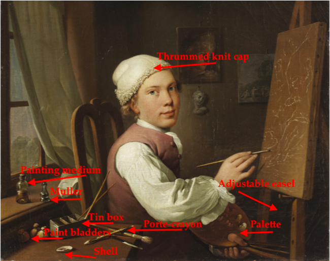
Jens Juel, Self portrait at an easel. Oil on canvas, 1766. Royal Academy of Fine Arts, Denmark.

Once again, I’m looking into artists’ materials and techniques, though instead of trying to kit myself out for the early Federal era, I’m digging into the last half (quarter) of the 18th century. It seems to be a time of rapid transitions in art materials as new pigments and media are developed. While Mr. Juel is beginning a work in oils, we still see some of the same tools that a watercolorist would use. Brushes, though his are shaped for working in oil; a shell, perhaps to combine pigment with medium, and bags of paint.

Before collapsible tubes were invented in 1841, artists scooped or scraped pigments mulled with medium into skin bags, secured them with twine or string, and then poked a hole in the bag to extrude pigment. Some more clever sorts would plug the hole with a cork– untying the bag would make more of a mess than a distribution system– but otherwise, you risked having your paint dry before you could use it up. Clearly there were some inefficiencies built into the system. (I think it also helps explain why “thick” paintings, that is, paintings using exuberant and textured layers of paint, do not appear until after collapsible tubes are invented and in wide use.)

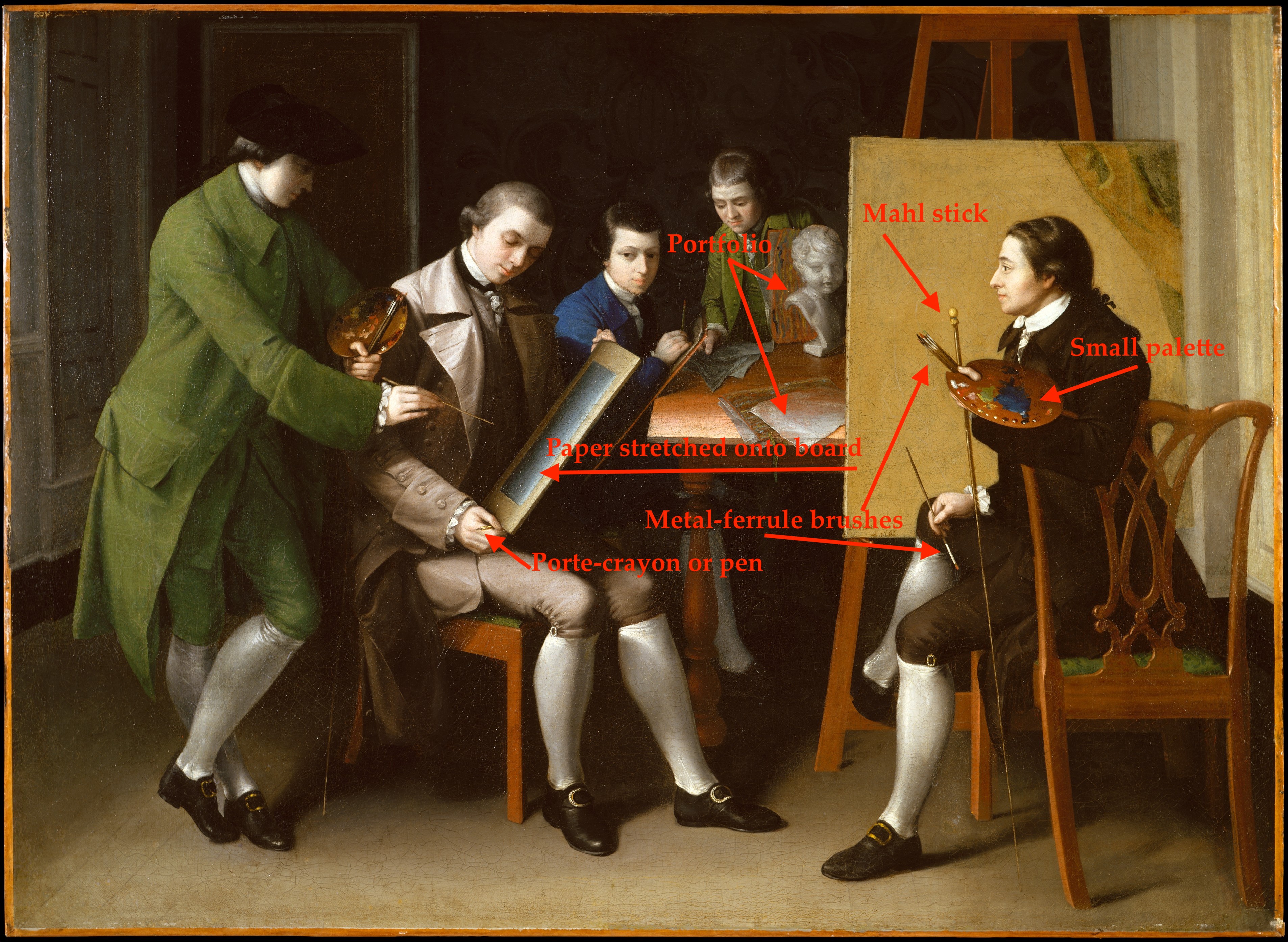
Matthew Pratt, The American School. oil on canvas, 1765. Metropolitan Museum of Art, Gift of Samuel P. Avery, 1897, 97.29.3

In Pratt’s American School, we can see how small the palettes are, and how small the dots of paint are compared to the pools where colors have been mixed. The easel, presented from another angle, offers clues to the adjustable pegs and triangular/tripod shape of the main support. But what of watercolors?

Winsor & Newton Old Paints: note the tiny bags of paint.

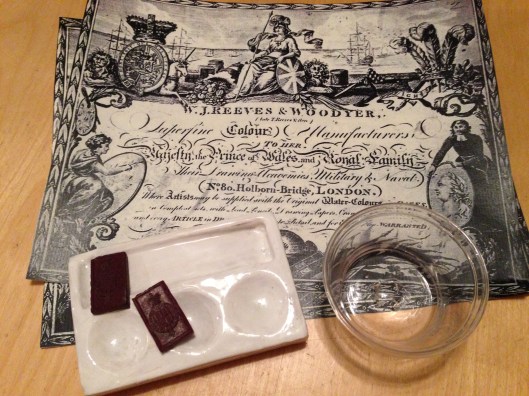
To date, I’ve found conservation reports more helpful than anything else, especially those analyzing paint content for sugars and gums. (One of the keys to watercolors was the re-wettable aspect of the colors; gum arabic, gum tragacanth and honey or sugar were ingredients used in varying proportions to achieve what we now take for granted.) The first watercolor cakes or blocks are introduced in 1780 by William Reeves; often, these were very hard, and had to be agitated in water (ground on a surface) to be used, much like sumi-e ink. Once paint was ground with water, it could be dried in a dish or container for re-wetting and later use. The question of course is, what do dry it in? How do you mix and use the paint?

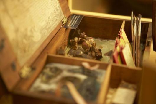
Caroline Schetky Richardson’s Paint Box
about 1820–30. MFA Boston. 1995.156.1

Mixing is simpler to solve: a palette, of course. The small, dirty-looking oval in the image above is the ivory palette used by Caroline Schetky Richardson; while her box is 1820-1830, it’s still very similar to box in Charles Willson Peale’s portrait of his brother James (below). The box is 21 inches wide, 10 inches high, and 13 inches deep. That makes the palette something like 3 inches wide, if we take a drawer as five inches wide.

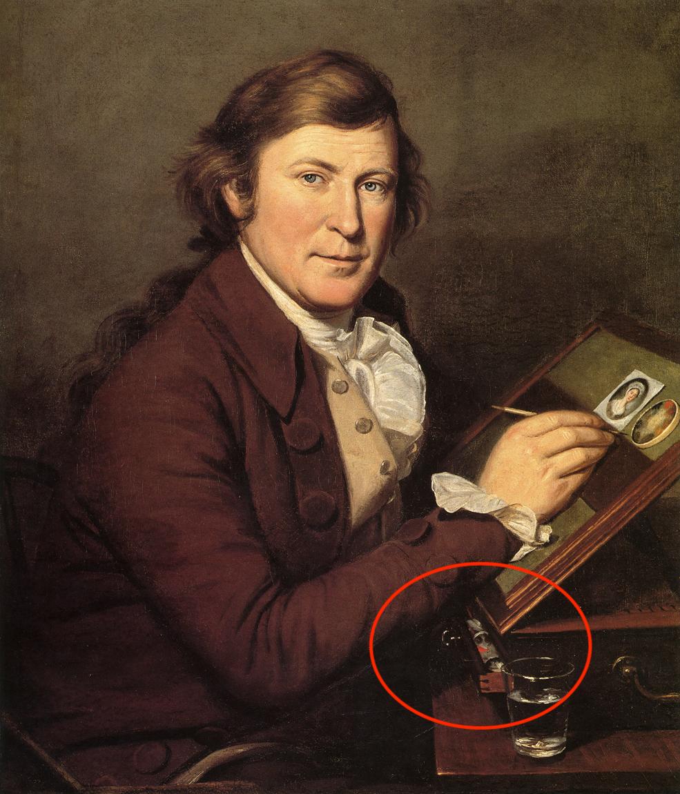
James Peale painting a miniature. Oil on canvas by Charles Willson Peale, 1795. Meade Art Museum, Amherst, MA

In the CWP portrait of JP, the slightly open drawer of the painting stand may be giving us a peek at his palette; the simple tumbler of water helps confirm that he is working in watercolor on ivory, and give us a sense of what kind of water container artists used– which, happily, can be more easily sourced than Mr Peale’s box.

Share this:

  • Click to share on Facebook (Opens in new window) Facebook
  • Click to share on Pinterest (Opens in new window) Pinterest
  • Click to email a link to a friend (Opens in new window) Email
  • Click to share on X (Opens in new window) X
Like Loading...

Reading the Night

18 Monday Dec 2017

Posted by kittycalash in material culture, Research

≈ 3 Comments

Tags

art history, context, engravings, lithographs, prints, semiotics

Francois-Robert Ingouf after Sigmund Freudenberger (French, 1747 – 1812 ), La soiree d’hyver, 1774, etching and engraving, Rosenwald Collection 1943.3.4377

Details. It’s all in the details, right? I see this print multiple times every day, and contemplate the little stories in the details of the room.

Francois-Robert Ingouf after Sigmund Freudenberger (French, 1747 – 1812 ), La soiree d’hyver, 1774, etching and engraving, Rosenwald Collection 1943.3.4377

Perhaps the first thing I noticed that jarred my eye (and my thinking) was the row of glass vases for forcing bulbs. They look so modern, don’t they? But the shape is classic– form following function– and findable today. How pleasing that my mother’s winter ritual of filling windowsills and mantles with forcing bulbs can be visually documented to one of my favorite eras–and was, indeed, common in the past. This is one of those “everybody did it” ideas I can endorse.

French François Linke Louis XVI Style Gilt Bronze and White Marble Clock
Francois-Robert Ingouf after Sigmund Freudenberger (French, 1747 - 1812 ), La soiree d'hyver, 1774, etching and engraving, Rosenwald Collection 1943.3.4377
Francois-Robert Ingouf after Sigmund Freudenberger (French, 1747 – 1812 ), La soiree d’hyver, 1774, etching and engraving, Rosenwald Collection 1943.3.4377

What else is on the mantle? A clock, undoubtedly ormolu– though it could be much worse. And yes, the cupid on the clock has meaning in this print.

And then there’s this: the hot water urn– or is it?

Tucked into the fire place, I was initially pretty sure that’s a hot water/tea/coffee urn, meant to go with the tea or coffee cup on the mantle (see above; it’s in front of the bulb vases). Hot tea or coffee would be welcome on a cold winter’s evening, and the water would stay warmer tucked close to the fire.

Francois-Robert Ingouf after Sigmund Freudenberger (French, 1747 - 1812 ), La soiree d'hyver, 1774, etching and engraving, Rosenwald Collection 1943.3.4377
Francois-Robert Ingouf after Sigmund Freudenberger (French, 1747 – 1812 ), La soiree d’hyver, 1774, etching and engraving, Rosenwald Collection 1943.3.4377
Tea urn. Silver, by John Carter II. 1773-1774. Metropolitan Museum of Art, 11.28a–f

18th Century Cast and Wrought Iron Fireplace Fire Grate

But it could also be a decorative fender, ornamented with urns at the ends. The fireplace grate shown here is English, made ca. 1780 according to the seller) but should you have space cash burning a hole in your pocket, there’s a similar 19th century reproduction of the one in the print for sale on the interwebs, should you care to recreate this image (I know some of you have the clothes). In fact, there are quite few fenders-with-urns, once you start looking, some in bronze and some in steel.

And what of this? Is that an 18th century dog house or covered dog bed? Yes, it is.

Dog kennel, by Claude I Sené, 1775-1780. Metropolitan Museum of Art, 1971.206.18
R-20100527-0015.jpg

The bouillotte candlestand on the table is another nice household detail, illuminating a book lying open on the table set against the wall.

R-20100527-0015.jpg
Screenshot 2017-12-17 10.48.42

It has taken me some time of looking at period images to accept these candle stands as correct, since my experience with them was grounded in electrified reproductions in suburban Colonial Revival dens and family rooms– a location I will admit I was prejudiced against to begin with, having grown up in a city surrounded by architects devoted to (and buildings by) Mies van der Rohe.

But therein lies the point of looking: what initially seems absurd (Versailles-quality dog beds) or simply anachronistic (candlestands with shades) slides into place when seen and understood, within its proper context.

Share this:

  • Click to share on Facebook (Opens in new window) Facebook
  • Click to share on Pinterest (Opens in new window) Pinterest
  • Click to email a link to a friend (Opens in new window) Email
  • Click to share on X (Opens in new window) X
Like Loading...

The Stuff of Life

07 Tuesday Nov 2017

Posted by kittycalash in Art Rant, Collecting, material culture, personal

≈ Comments Off on The Stuff of Life

Tags

art history, collections, interpretation, material culture, meaning, objects, provenance

We all love things, don’t we? Things in the literal, corporeal, piled-in-a-heap sense: plates, shoes, books, chairs, necklaces, models. But what makes us love them? How deeply do we really love them?

Someone posed the questions, What would you take if you had to pack in a hurry to leave home forever? What will your kids remember you by?

Those are hard to unpack: how will other people remember us? Often, we have no idea what we mean to other people, even the ones closest to us. It’s easier for me to know what I would take or keep to remember someone else by– a single sleeve link; a wooden train engine; a stainless steel spoon; a necklace of handmade beads. None of those things reflects what is truly meaningful to me about them, that is, without my knowledge, these aren’t particularly interesting or aesthetic objects. What makes them special is the story I attach to them.

That is, of course, the key to interpreting objects in a social history context: the story is what makes the object more interesting, more important, more compelling. It’s the difference between a provenanced and an unprovenanced object, between a roundabout (or corner) chair in context, and one out of context.

Corner chair, probably John Goddard. Metropolitan Museum of Art, L2014.9.1a,b Lent by the Wunsch Collection, 2014

This is not to say that beautiful things are without value removed from context, but what makes that Goddard chair more compelling is knowing who made it, who it was made for, and when– knowing that it was part of a set of furniture ordered to furnish a house for Providence newlyweds, made in Newport by one of the hottest makers of the time. It’s the people who make the object more interesting, who make it worth having, seeing, holding on to– whether it’s a $6 million chair or a $25 mug, memories and stories make things compelling beyond our associations with them.

Part of a museum curator’s job is understanding those stories, placing objects in context, and connecting them back to their stories, to their makers, users, owners, and keepers. We may buy things because they’re beautiful or useful, but often we keep them because of their meaning– which is, more often than not, about people. Unprovenanced objects have less meaning; an object sold outside, or without, its context will not fetch as much. Value resides in people, not in things.

I think of this not only because a portion of my work is to recreate or reestablish the human contexts and connections for things, but because there is a human instinct to grab onto something tangible (like an object), rather than something ethereal (like a memory), even though what will sustain us in the end is not things, but other people, and our memories of them.

Share this:

  • Click to share on Facebook (Opens in new window) Facebook
  • Click to share on Pinterest (Opens in new window) Pinterest
  • Click to email a link to a friend (Opens in new window) Email
  • Click to share on X (Opens in new window) X
Like Loading...
← Older posts
Newer posts →

Archives

wordpress statistics

Creative Commons License
Kitty Calash blog by Kirsten Hammerstrom is licensed under a Creative Commons Attribution-NonCommercial-ShareAlike 4.0 International License.

Website Built with WordPress.com.

  • Subscribe Subscribed
    • Kitty Calash
    • Join 621 other subscribers
    • Already have a WordPress.com account? Log in now.
    • Kitty Calash
    • Subscribe Subscribed
    • Sign up
    • Log in
    • Report this content
    • View site in Reader
    • Manage subscriptions
    • Collapse this bar
 

Loading Comments...
 

    %d