• Home
  • Completed Costumes/Impressions
  • Emma and Her Dresses
  • Free Patterns and Instructions

Kitty Calash

~ Confessions of a Known Bonnet-Wearer

Kitty Calash

Tag Archives: art history

The Stuff of Life

07 Tuesday Nov 2017

Posted by kittycalash in Art Rant, Collecting, material culture, personal

≈ Comments Off on The Stuff of Life

Tags

art history, collections, interpretation, material culture, meaning, objects, provenance

We all love things, don’t we? Things in the literal, corporeal, piled-in-a-heap sense: plates, shoes, books, chairs, necklaces, models. But what makes us love them? How deeply do we really love them?

Someone posed the questions, What would you take if you had to pack in a hurry to leave home forever? What will your kids remember you by?

Those are hard to unpack: how will other people remember us? Often, we have no idea what we mean to other people, even the ones closest to us. It’s easier for me to know what I would take or keep to remember someone else by– a single sleeve link; a wooden train engine; a stainless steel spoon; a necklace of handmade beads. None of those things reflects what is truly meaningful to me about them, that is, without my knowledge, these aren’t particularly interesting or aesthetic objects. What makes them special is the story I attach to them.

That is, of course, the key to interpreting objects in a social history context: the story is what makes the object more interesting, more important, more compelling. It’s the difference between a provenanced and an unprovenanced object, between a roundabout (or corner) chair in context, and one out of context.

Corner chair, probably John Goddard. Metropolitan Museum of Art, L2014.9.1a,b Lent by the Wunsch Collection, 2014

This is not to say that beautiful things are without value removed from context, but what makes that Goddard chair more compelling is knowing who made it, who it was made for, and when– knowing that it was part of a set of furniture ordered to furnish a house for Providence newlyweds, made in Newport by one of the hottest makers of the time. It’s the people who make the object more interesting, who make it worth having, seeing, holding on to– whether it’s a $6 million chair or a $25 mug, memories and stories make things compelling beyond our associations with them.

Part of a museum curator’s job is understanding those stories, placing objects in context, and connecting them back to their stories, to their makers, users, owners, and keepers. We may buy things because they’re beautiful or useful, but often we keep them because of their meaning– which is, more often than not, about people. Unprovenanced objects have less meaning; an object sold outside, or without, its context will not fetch as much. Value resides in people, not in things.

I think of this not only because a portion of my work is to recreate or reestablish the human contexts and connections for things, but because there is a human instinct to grab onto something tangible (like an object), rather than something ethereal (like a memory), even though what will sustain us in the end is not things, but other people, and our memories of them.

Share this:

  • Click to share on Facebook (Opens in new window) Facebook
  • Click to share on Pinterest (Opens in new window) Pinterest
  • Click to email a link to a friend (Opens in new window) Email
  • Click to share on X (Opens in new window) X
Like Loading...

Reading Double

07 Saturday Oct 2017

Posted by kittycalash in Book Review, History, Research

≈ 2 Comments

Tags

18th century, art history, common people, history, interpretation

The mop trundler. Chambars after Penny. Bodleian Library, University of Oxford: John Johnson Collection

Photo by J. D. Kay, 2013

I love this image, and the original on which it is based. I love it so much that we’ve recreated it (in a later time period) whilst fooling about during a photoshoot.

But what does it really show? The image in the print depicts a passage in Jonathan Swift’s poem, A Description of a City Shower,

Such is that sprinkling which some careless quean
Flirts on you from her mop, but not so clean:
You fly, invoke the gods; then turning, stop
To rail; she singing, still whirls on her mop.

Straightforward, right?

Well, not so fast. Thanks to the wonders of ILL, I’ve been reading The Satirical Gaze: Prints of Women in Late Eighteenth-Century England, by Cindy McCreery, and looking at prints anew. Her chapters on prostitutes and old maids are particularly interesting, and confirm some of what I had been thinking about when we use prints as documentation.

Here, in the Macaroni Provider, we have what is “Probably a portrait of some (alleged) notorious procurer; perhaps Thomas Bradshaw whose portrait he somewhat resembles.” We have a pimp, folks.

The Macaroni Provider / Macaronies, Characters, Caricatures & designed by the greatest personages, artists &c graved & published by MDarly, 39 Strand. 1772 (Vol.3). British Museum

So, with this information in hand, let’s look again at The City Shower. We have a maid– one of the few classes of women found in city streets unaccompanied, and a class of women often associated with prostitution (along with street vendors and market sellers). The fashionably dressed man recoils from the spray from her mop– is he rejected the literal filth, or the implied filth of a “maid of all work,” who may have a venereal disease? Is it reasonable to wonder if Swift is using double entendres in the lines Such is that sprinkling which some careless quean
Flirts on you from her mop, but not so clean, 
so that the mop is the woman’s pubic hair, and not so clean suggests she is diseased?

I don’t know, and absent intensive research or a time machine, I may never know. But once again I wonder how we use and understand these images, and think that they pose more questions than answers. McCreery’s book (based on her dissertation) helps get at some of these issues, and is well worth a read. (I found the Amazon review hilarious, myself, once I had the book in hand. No, it’s not a compendium of prints; it’s an analysis.)

Share this:

  • Click to share on Facebook (Opens in new window) Facebook
  • Click to share on Pinterest (Opens in new window) Pinterest
  • Click to email a link to a friend (Opens in new window) Email
  • Click to share on X (Opens in new window) X
Like Loading...

A Vision in Vermillion

22 Friday Sep 2017

Posted by kittycalash in Art Rant, Book Review, Clothing, History

≈ 3 Comments

Tags

18th century clothing, american art history, art history, British Army, fine art, John Copley, uniforms

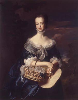
Lt. Joshua Winslow, oik on canvas by John Singleton Copley, 1755. Santa Barbara Museum of Art.

Or scarlet, as the case may be.

I’m reading Jane Kamensky’s “A Revolution in Color: The World of John Singleton Copley,” and just 56 pages in, I’m annoyed.

Writing about Copley’s success at painting military officers during the 7 Years War, currently at the Santa Barbara Museum of Art, though not online, Kamensky says of the 1755 portrait of Joshua Winslow:

“Hanging in his quarters at Fort Lawrence, Winslow’s portrait in uniform would have served as a subtle reminder of his valuable connections. Copley’s three-quarter-length portrait lavishes attention on the young officer’s silver lace and pulsing red coat, a uniform more elaborate than the one he likely wore. The painter seemingly delights in the play of light upon shining surfaces, from the buff-colored sateen pulled taut across Winslow’s ample waist to the golden braid and tassel dangling from his silver-hilted sword.” (pp 56-57; emphasis added.)

1760-65 Uniform of Captain Thomas Plumbe of the Royal Lancashire Militia.

I missed that bit about sateen last night when I read this aloud to Drunk Tailor, so let’s roll back to the part that first set me off: the young officer’s silver lace and pulsing red coat, a uniform more elaborate than the one he likely wore.

Ahem.

Here’s the 1760-65 uniform of the 1st Royal Lancashire Militia as worn by Captain Thomas Plumbe.  “The oldest, most complete, British army uniform in the world, similar to the pattern worn at the Battle of Culloden in 1746 and in the Wars of American Independence.”

Granted, Plumbe’s uniform is later than Winslow’s portrait, and Plumbe was a Captain and Winslow a Lieutenant, but the difference between them is rather less than, say, a private and a captain. Why does Kamensky assume that Winslow’s uniform is not the one he wore? Is it the lace? Winslow held a commission, and served as paymaster and commissary, roles Kamensky describes as “relatively modest.” Yes, Lieutenant isn’t Colonel; it’s the baby of officers, but it’s still commissioned officer and reasonably responsible (and, one might imagine, relatively remunerative if one was hooked into the Boston mercantile network). And uniforms were ornamented with tape, in gold, silver, or wool– see below, in Morier’s painting of two privates. (I further wonder whether it’s reasonable to describe a portrait of 50″ x 40″ as subtle, but perhaps it was placed in an enormous room.)

Privates, 119th (Prince’s Own) Regiment of Foot, 1762-3. Oil on canvas by David Morier. RCIN 406873 Royal Collection Trust/© Her Majesty Queen Elizabeth II 2017

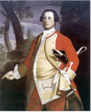
From Winslow, Kamensky moves to Brattle. “As his personal, military, and commercial fortunes rose in tandem, Brattle commissioned Copley to portray him in a fanciful uniform nearly identical to the one in Joshua Winslow.” (p 58 emphasis added)

William Brattle, oil on canvas by John Singleton Copley, 1756. Harvard Art Museums/Fogg Museum, Partial Gift of Mrs. Thomas Brattle Gannett and Partial Purchase through the generosity of Robert T. Gannett, an Anonymous Donor and the Alpheus Hyatt Purchasing Fund 1978.606

Fanciful? Fancy to our eyes, yes. Fanciful, no. Brattle was eventually a Major-General, so the uniform portrayed here, when he was likely a captain (same rank as Plumbe), seems pretty reasonable. If we were considering replicating a Massachusetts officer’s uniform ca 1755, we would consider Brattle and Winslow’s biographies and ranks, compare the two portraits of two men, probably both captains at this time, and, cross-referenced with Plumbe’s amazingly extant uniform and the 1751 warrant, begin to form an opinion that we would be making a coat in scarlet superfine broadcloth faced with buff, with buff small clothes, gold tape, and domed buttons. (Sateen is a weave structure, and wool sateen was not used in military uniforms.)

But that’s now how Kamensky is approaching this, of course, and why would she? She’s a historian, not a curator, material culture person, or a reenactor. Why does she assert that the uniforms worn by Winslow and Brattle are fanciful, and “more elaborate” than what they wore– without a footnote to back that assertion? And why does she then describe Major George Scott’s portrait “as the meticulously rendered uniform of his parent regiment, The Fortieth Foot” in contrast to “the fanciful, half-imagined costumes of Winslow and Brattle”? (p 58)

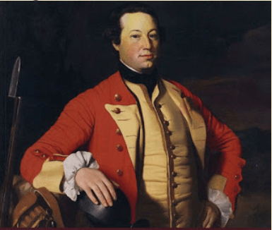
Major George Scott (detail), oil on canvas by John Singleton Copley, 1755-58. Private Collection

The sitters’ biographies are footnoted, but nothing appears in the notes about the uniforms. Kamensky makes a great leap to the “fanciful,” which I find curious, considering that most male portraits are rendered carefully if flatteringly, and many female portraits are made for the male gaze, and are more likely to be “fanciful” or “fancy dress.”

Grenadiers, 40th Regiment of Foot, and Privates, 41st Invalids Regiment and 42nd Highland Regiment, 1751. Oil on canvas by David Morier, 1751. RCIN 405589 Royal Collection Trust/© Her Majesty Queen Elizabeth II 2017

We are fortunate to have the David Morier image of a grenadier of the 40th to compare with the slightly later Scott portrait; I like the grenadier’s belly box, which appears on the left of Scott’s portrait and is described by Kamensky as “”tricked out for foul-weather fighting.” (p 59) Did I miss something? Were belly boxes and cartridge boxes once flap-free? I stumble over “tricked out,” too, which seemed to betray a particular lack of interest in understanding what Copley was portraying.

I find myself wondering how it is that historians and art historians can write so confidently about images without understanding the material depicted. It’s as if they are all context and no content, while many reenactors/costumers favor content over context. In any case, having encountered these speed bumps in the book, I’ll certainly be reading it with a dose of skepticism when portraits are dissected.

Adam Stephen’s Waistcoat and Gorget
Date: ca. 1754
Catalog #: 12197; 12199 gorget Accession #: 52984
Credit: Division of Military History and Diplomacy, National Museum of American History

Edited to add: Drunk Tailor reminded me after I posted this that the NMAH possesses an actual officer’s waistcoat from the 1750s. Here’s the General History note in the online exhibit: “In 1755, the officers of the Virginia Regiment received orders from Washington to provide themselves with a “Suit of Regimentals” of good blue cloth. The coat was to be faced and cuffed in scarlet and trimmed with silver; they were to wear blue wool breeches and a scarlet wool waistcoat with silver lace.”

Scarlet wool waistcoat with silver lace. Sure does resonate with those portraits of Winslow and Brattle, and makes me all the more uncomfortable Kamensky’s assertions of “fanciful” depictions.

Share this:

  • Click to share on Facebook (Opens in new window) Facebook
  • Click to share on Pinterest (Opens in new window) Pinterest
  • Click to email a link to a friend (Opens in new window) Email
  • Click to share on X (Opens in new window) X
Like Loading...

Hell is a Hand Basket

15 Thursday Sep 2016

Posted by kittycalash in Art Rant, Clothing, Fail, History, material culture, Research

≈ 5 Comments

Tags

18th century, 18th century clothes, art history, authenticity, baskets, Costume, dress, fashion, interpretation, John Copley, john smibert, Joseph Blackburn, portraits, Research

Gentle Reader: Remember the post on semiotics? We need to go back to that once more.

Just what are we looking at here?
copley_john-singleton-mrs-daniel-rogers-middleton-collection

John Singleton Copley.
Portrait of Mrs. Daniel Rogers (Elizabeth Gorham Rogers), 1762
50 X 40, oil on canvas.
Middleton Collection, Wake Forest University
HC1991.1.1

Hmm…. 1762. Does that dress look like 1762 to you? Or does it resemble a 17th century garment? Check out those sleeves: scallops. The shift sleeves: super full. The line of the gown at the neck: a shallow scoop. The front of the bodice: closed.

Are those the hallmarks of a typical 1762 gown in New England, England, or France? You are correct, sir: They are not.

What’s happening here? What is Copley doing, and why?

He’s making his subject look good, reflecting her wealth and status. He’s flattering her by painting her in a faux-17th century gown, a “Vandyke costume, a popular artistic convention in England related to the vogue for fancy dress and masquerade.”* 1762 seems a trifle late for this convention, but in 1757, James McArdell produces a mezzotint of Thomas Hudson’s portrait of the Duchess of Ancaster. Henry Pelham wrote to Copley in 1776 that he had purchased one of those mezzotints, suggesting their use as references for Colonial American painters. Reynolda House has a nice explication of this style of dress in the Thëus portrait they own of Mrs. Thomas Lynch, shown below.

Mrs. Thomas Lynch, oil on canvas by Jeremiah Thëus, 1755. Reynolda House, 1972.2.1

Mrs. Thomas Lynch, oil on canvas by Jeremiah Thëus, 1755. Reynolda House, 1972.2.1

There was also a convention of portraying women in “timeless draperies,” following the school of Peter Lely and Godfrey Kneller, both late 17th-century English painters who produced portraits with generalized costumes.

Lady Mary Berkely, wife of Thomas Chambers. oil on canvas by Sir Godfrey Kneller, ca. 1700. Metropolitan Museum of Art, 96.30.6

Lady Mary Berkely, wife of Thomas Chambers. oil on canvas by Sir Godfrey Kneller, ca. 1700. Metropolitan Museum of Art, 96.30.6

This portrait by Kneller (born in Germany, he worked in England) explains a lot, doesn’t it? And this timeless convention persists for some time, and the stylization of the facial features and hair is copied by English and colonial American painters. John Smibert, long familiar to many of you, was a leading practitioner of this style of portrait, and his work would have been well known to Copley and his sitters.

Mrs Samuel Browne by Smibert, RIHS 1891.2.2

Mrs Samuel Browne by Smibert, RIHS 1891.2.2

Blackburn’s portrait of Mary Sylvester adopts two conventions at once, in a way: she’s in timeless-style drapery and fancy dress as a shepherdess. Let’s remember, too, that there’s symbolism in the shepherdess imagery, referencing pastoral innocence and Mary Sylvester’s unmarried, presumably virginal, status. Don’t believe me? Read the catalog entry, written (at the very least) under the supervision of actual, degree-toting art historians.

Mary Sylvester, oil on canvas by Joseph Blackburn, 1754. Metropolitan Museum of Art, 16.68.2

Mary Sylvester, oil on canvas by Joseph Blackburn, 1754. Metropolitan Museum of Art, 16.68.2

Where does that leave us with Mrs. Rogers? She’s portrayed in what is essentially fancy dress, holding her straw hat in her left hand (much as Mary Sylvester is) with a basket over her right forearm. You will note the open work of the basket, the delicate arches and the fineness of the base. What’s in it? Something gauzy, as light as the drape around her shoulders, with a square of dark blue silk and a fine white silk ribbon. Honestly I am not entirely certain — the resolution of the image is dreadful.

But what’s NOT in the basket? A redware or pewter mug, sewing, keys, bottle, food, candy, toys, or, really, anything of a very concrete or practical nature.

Is this image a justification for carrying a [nearly empty ] basket on the streets of Boston? Of course it is–as long as you justify walking the streets of Boston in imaginary or fancy dress.

*p.106, Ribeiro, Aileen. “‘The Whole Art of Dress’: Costume in the Work of John Singleton Copley.” John Singleton Copley in America, Metropolitan Museum of Art, 1995.

Share this:

  • Click to share on Facebook (Opens in new window) Facebook
  • Click to share on Pinterest (Opens in new window) Pinterest
  • Click to email a link to a friend (Opens in new window) Email
  • Click to share on X (Opens in new window) X
Like Loading...

What’re you lookin’ at?

23 Tuesday Aug 2016

Posted by kittycalash in Art Rant, Living History, Reenacting, Research

≈ 5 Comments

Tags

art, art history, fashion, interpretation, semiotics

Pupils of Nature.hand-colored etching published by S W Fores after Maria Caroline Temple, 1798. British Museum, 1867,0713.409

Pupils of Nature.hand-colored etching published by S W Fores after Maria Caroline Temple, 1798. British Museum, 1867,0713.409

No, really: Do you know what you are looking at?

When we set out to make historic clothing and costumes, it’s important to understand our sources. Newspaper advertisements and account books are one source of information that can be difficult to decode: from Swankskin to Tammies to Shalloons, Nankeens, and Calimancos, we encounter words we do not understand. Dictionaries can help, but it is as well to remember that we need that help decoding the words.

We don’t get the same handy, universal guidebook in quite the same way when we look at extant garments. What we do often get is provenance. Knowing a garment’s history is essential to truly understanding it. It helps date the item, for one thing, and understanding the history of the wearer gives us even more information about the clothing. How old was the person when this was worn? What was their social status? Income level? And if there are mends and alterations: even better!

I came to understand the family who lived in the house where I work more clearly through their clothes. Muslin waistcoat fronts that, on examination, are not truly out of the tippy-top drawer helped me see the Big Fish/Small Pond nature of the family and their wealth. You may be a Playa in backwater Providence, but you Just Another Guy in Philly. It was a little window into the insecurities of the father, and how those played out in his reaction to his daughters’ marriages.

The Unfortunate Beau, etching, Publish'd as the Act directs 12th Sept 1772, by S.Hooper, No.25 Ludgate Hill. British Museum 1991,1214.20

The Unfortunate Beau, etching, Publish’d as the Act directs 12th Sept 1772, by S.Hooper, No.25 Ludgate Hill. British Museum 1991,1214.20

But (in the grand scheme of things) there are only so many newspaper ads and account books and few enough garments, let alone the zebras of garments with solid provenance. The groups are smaller still when you consider relevance to what you need or want to know or replicate. Small state? You’ll have a small pool.

So we turn, often, to images. Here again, provenance is helpful when we look at a portrait. Even knowing the maker is helpful: Ralph Earl or James Earl? Portraits by brother James aren’t the same level as those by Ralph, so you get a different kind of information. But that’s all quite aside from what’s contained within the image– and that’s even before you begin to consider what you are doing when you replicate the image.

Understanding the symbols and meanings of images and objects is slightly esoteric but questioning your sources (Interrogating the Object, if you will) allows you to better understand what the heckers you are doing and how it may be perceived. In the pursuit of historical clothing, living history and reenacting, that is more important than we credit. Do we really know what the sources mean? I’ve argued before that we don’t-– and that doesn’t mean DON’T it means USE WITH CAUTION. We’re long removed from the details of, say, satirical engravings that lack a literary source, so those need especial caution as sources. We lack the context.

The Bargain Struck, or Virtue conquer'd by Temptation. Mezzotint, 1773. British Museum 1935,0522.1.130

The Bargain Struck, or Virtue conquer’d by Temptation. Mezzotint, 1773. British Museum 1935,0522.1.130

Now, if your goal is straightforward: replicating costume for fun, say, you will care less about the notion of meaning within images than someone who is trying to understand the past by inhabiting the clothing with the hope of gaining insight into the worldview of the past. That second category is possibly a more tortured group of souls than the first, laboring as we do at an impossible task.

We are talking about semiotics here, and if you want a quick intro, The Signs of Our Time by Jack Solomon, PhD clocks in at 244 pages including bibliography. It’s old– 1988– and perhaps oversimplified, but we’re not in graduate seminar here, so it will do for our purposes. Solomon’s book contains a handy list he calls the Six Principles of Semiotics:

  1. Always question the “common sense” view of thing, because “common sense” is really “communal sense”: the habitual opinions and perspectives of the tribe.
  2. The “common sense” viewpoint is usually motivated by a cultural interest that manipulates our consciousness for ideological reasons.
  3. Cultures tend to conceal their ideologies behind the veil of “nature,” defining what they do as “natural” and condemning contrary cultural practices as “unnatural.”
  4. In evaluating any system of cultural practices, one must take into account the interests behind it.
  5. We do not perceive our world directly but view it through the filter of a semiotic code or mythic frame.
  6. A sign is a sort of cultural barometer, marking the dynamic movement of social history.

Now that you’ve read the list, perhaps what I obsess about will be clearer: we don’t fully understand the culture of the past. We don’t have the same semiotic or mythic filter than the people of the 18th century had, but when we recognize first that they had a filter, and second that the filter varied from culture to culture, we can better understand our sources.

If you can accept that the cultural filters of England and France and the United States were all different, perhaps it will be easier to accept that you cannot mimic a French fashion plate in portraying a middle-class New England woman without encountering some questions. But if you replicate that fashion plate for the pleasure of experiencing that fashion moment, that’s another game altogether.

Intention matters. Your goal will dictate your sources, and how you use them. As committed as I am to the everyday (because no one is documenting us or saving us, no matter how desperately we try to signal our being with Facebook and Instagram posts), I’m not suggesting that we all attempt to recreate the same past. I’m arguing that we strive to understand what we are doing (dressing up, portraying a specific character, portraying an archetype) and that when we know what we are doing, we understand better how to use the sources we have.

Share this:

  • Click to share on Facebook (Opens in new window) Facebook
  • Click to share on Pinterest (Opens in new window) Pinterest
  • Click to email a link to a friend (Opens in new window) Email
  • Click to share on X (Opens in new window) X
Like Loading...
← Older posts
Newer posts →

Archives

wordpress statistics

Creative Commons License
Kitty Calash blog by Kirsten Hammerstrom is licensed under a Creative Commons Attribution-NonCommercial-ShareAlike 4.0 International License.

Website Built with WordPress.com.

  • Subscribe Subscribed
    • Kitty Calash
    • Join 621 other subscribers
    • Already have a WordPress.com account? Log in now.
    • Kitty Calash
    • Subscribe Subscribed
    • Sign up
    • Log in
    • Report this content
    • View site in Reader
    • Manage subscriptions
    • Collapse this bar
 

Loading Comments...
 

    %d